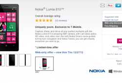
T-Mobile Rolling Out New Website Design With Cleaner Look, Lots Of Free Space
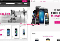
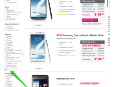
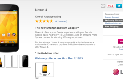
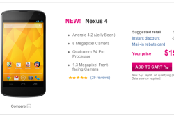
I wouldn’t say a new website design for T-Mobile is monumental news but as someone who appreciates simple and clean websites, the new look is something I’m digging. For some there may be a too much white/empty space, but the site is definitely simplifying the number of options one must choose to move through T-Mobile’s smartphone and rate plan selection. Gone are … [read full article]


