iPhone 6 Plus Review – Apple’s outstanding entry to the “phablet” market
I use “phablet” in quotation marks for one reason: While a year or two back, the term could be used for a specific area of the smartphone market, in 2014 that’s not so easy to do. Where there was once a line of size distinction, it’s now blurred. Device screen sizes range from 4.5-inches to 5.7-inches, and many of today’s flagships devices are those with displays above the 5-inch mark.
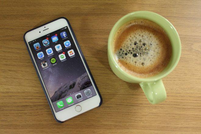
But in Apple’s case, there are two new devices. One is 4.7-inch, clearly designed to be the popular “flagship” model, and one – this one – is a 5.5-inch model. It’s obviously the gap between “regular” smartphone size and tablet. And it’s fantastic.
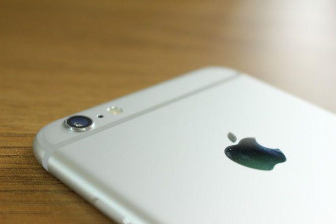
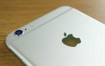
There are only two things I don’t like about the iPhone 6 Plus’ design: The plastic antenna bands on the back, and the protruding camera. The bands have been a feature on the iPhone since iPhone 4 was released with its metal, external antenna. But Apple’s always done a good job of hiding them. With the iPhone 5 and 5s, they were hidden by the glass panels on the top and bottom of the iPhone’s back. And I wish they were kept on the iPhone 6 and 6 Plus. Because – for a company that’s so obsessive over design – it seems a horrible oversight to have them in plain sight, and so ugly too. The other – protruding camera lens – could be fixed by making the iPhone 6 Plus a little thicker. Which, in turn, would fix the other #bendgate problem.
Of course, bendgate’s biggest problem is that it’s been way overblown out of all proportion. But that’s not to say it’s not an issue at all. It’s clear that the iPhone 6 Plus has some kind of weak point just below the volume buttons. But it’s not like it’s made of butter. The phone won’t just bend magically one day when you put it in your pocket. Mine’s completely straight, just like it was when it came out the box. It’s been in and out of my pocket, walked around with, probably sat on once or twice. It may bend easier than an iPhone 6, or iPhone 5s, or Galaxy Note. But it still needs more than your average daily stress or strain to change its shape permanently.
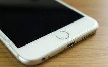
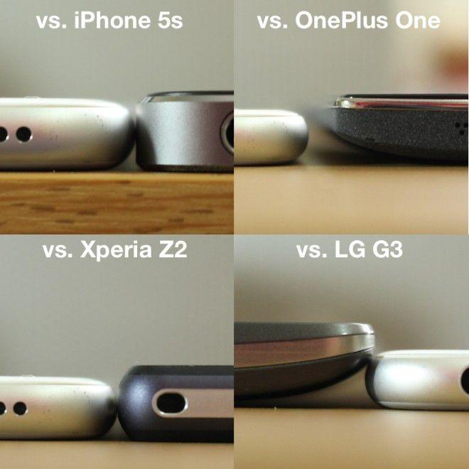
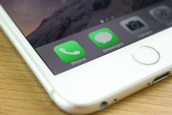
Now that we have the elephant in the room out the way, the rest of the iPhone’s design is exemplary. I love that Apple’s returned to using rounded edges on its newer iPhones. It makes them far more comfortable to hold than the square, flat-edged sides on the iPhone 4/4s and 5/5s ever were. Some might criticize the overall thinness, saying it’s too thin. But I love the way it feels. What’s particularly pleasing is the gentle curve on the edge of the glass front panel. It almost makes the device seem like it has no seams anywhere. Like it’s one continuous surface all the way around.
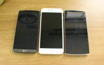
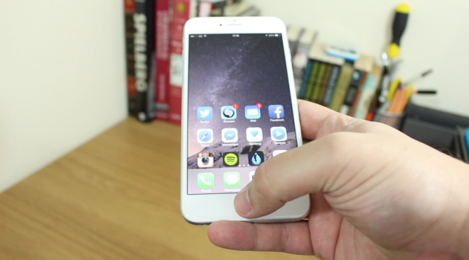
The power button relocation makes complete sense, now that the phone is larger. It’s easy enough to reach on the right hand side. I can’t imagine how frustrating it would be to use if it had remained on the top edge. Personally, I’m used to larger phones. And thanks to its slim profile, it’s pretty easy to hold. But it’s clearly a lot taller than most devices of the same category. I’m thinking here of the OnePlus One, LG G3 and even the Desire 816. But still, for such a large device, it feels small in hand.
Fit and finish, precision and engineering is all as brilliant as you’d expect from an Apple product. Making it – in my mind – the best looking large smartphone on the market today.
There are higher resolution displays on the market than the Retina HD 1080p panel. But you’ll be hard-pushed to find any better ones. Viewing angles are terrific, whites are clear and darks/blacks are way darker than we’ve ever had on an iPhone. And it’s big, which is a huge deal for many.
For the past 9-12 months I’ve been using an Android Phone as my daily go-to device. And it’s primarily because of the display size. It’s not just watching movies, gaming or enjoying content that’s better on a larger screen. It’s also that it’s much easier to type without needing to pray to the auto-correct gods that you won’t make any embarrassing typographical errors while texting your mother. Or partner. Or mother’s partner.
5.5-inch is my sweet spot. Two years ago, I never thought it would be. But here we are. I love big, sharp and crisp displays. And Apple’s clever new LCD panels use angled sub-pixels to make sure that the image and colors aren’t distorted when you’re looking at it from an angle.
If you’re an iPhone loyalist, you’ll also notice a couple of extra plus points: Colors are more vivid and the content is much closer to the surface of the glass. It’s also much better outdoors in bright daylight thanks to a new polarizing filter placed between the glass and the LCD panel.
In short: it’s a brilliant display in almost every aspect. Content of every kind looks gorgeous, full of life and very sharp.
Staying out of the megapixel race has served Apple well in the past. Instead, the company focusses on making those pixels capable of producing fantastic images. And it’s done the same this year. We may have the same 8 million pixels as last year, but they’re so much more capable.
First thing I noticed right off is how much better and quicker it was at focussing. And that’s thanks to the phase detection autofocus. It’s a pretty clever technology, similar to what’s used in DSLR cameras to get focussing bang-on every time. Taking pictures of moving subjects doesn’t produce as much blur, and it’s better at focussing on objects in low light. The iPhone 6 Plus also has OIS (optical image stabilization) built in which helps compensate for you being on unsteady ground, or just moving in general.
If I have one criticism, it’s that it’s still not as good at capturing tons of light in low light settings as – let’s say – the HTC One (M8), Xperia Z2 or Lumia 930. But it more than makes up for it with the results you can get in decent light. Colors – for the first time – have some life. They still look natural, but they’re more vivid than they’ve ever been on an iPhone. HDR seems to have a much more noticeable effect too.
The camera has some other tricks up its sleeve. Built in are Time-lapse, Apple’s impressive auto-exposing panorama mode, and a new 240 frames-per-second slow motion recording. Add that to the great 1080p video recording, and you have an all-round fantastic camera.
Granted, some of you who like have extra manual controls over your photography may not like the standard user interface that much. But, some great apps like Camera+ have already been updated to take advantage of the new hardware and give your extra control. You’ll be hard-pushed to find a camera that gives you the same performance, with so little effort from the user.
To an Android user, particularly those who used larger devices, having a device that can achieve more than a day’s use on a single charge is old news. To iPhone users it’s the stuff of make believe. Previous to this year, that dream has remained in the realm of real life unicorns and “one day I want to go to the moon.” But it’s here.
In my first 10-11 days use, my 100% charge consistently got me 9.5 hours of use, plus over a day of standby. Meaning: I could go 1.5 to 2 days between plugging it in. For heavy users, you should get a full working day out of it. And that’s thanks mostly to the new 2915mAh battery. But I still can’t help imagining how good it would be if Apple made the device a little thicker, and put a bigger battery in.
As for performance, as always, iOS is smooth, quick and fluid. Launching apps is effortless and the extra horsepower behind the new dual-core A8 chipset really shows. The only times I noticed any stutter or lag were during the early days of iOS 8.0.0. The software was clearly in its juvenile stages and some things just weren’t working right.
Networking performance has been top-drawer too. But particularly pleasing to T-Mobile users will be the fact that it’s compatible with VoLTE and Wi-Fi calling, as well as compatible with all T-Mo’s LTE bands (except band 12, 700MHz).
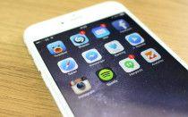
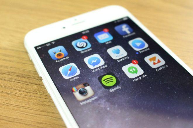
If there’s one area of unfulfilled potential with the iPhone 6 Plus, it’s in software. I can’t help but feel Apple could have done more with the platform to take advantage of the huge screen. But I don’t think it’s there yet. App Folders, inexplicably, still only display 3×3 grids of apps, leaving a tone of blank space above and below.
That’s taking nothing away from what has been done. The two-panel view in Mail and Messages, among other stock apps, is very welcome. As are all the extra keys in the landscape software keyboard. But that’s it. There’s also the new “reachability” feature that brings down all the hard-to-reach content from the top of the screen when you double-touch the Touch ID sensor. I’ve not really had any cause to use it, but it’s there. Which is, nice?
Of course, third party app developers will have a bigger say on what can and can’t be done on the iPhone 6 Plus’ display. It’s in the App Store we’re going to need to look for all the finest programs and games designed to take full advantage.
A big phone’s not for everyone. So I can’t claim that the iPhone 6 plus is the best phone on the market right now. But for me personally, it’s the closest thing to perfect I’ve used thus far. Yes, that’s an entirely subjective view, but it’s how I feel. I have three great Android phones sat on my desk that haven’t been powered on since I got the iPhone 6 Plus. It’s addressed almost all the areas that I went to Android for: Big screen, better battery life and better third party extensions and keyboards. With iOS 8 and iPhone 6 Plus, Apple’s aimed squarely at the areas Android has dominated for the past few years.
Yes, it could have better battery life, and it could be more durable. But as an all-round package of hardware, software and services, it’s hard to argue with the daily experience of using one of Apple’s newest iPhones.

