New T-Mobile Android app leaks with fresh design in tow
It was rumored that a new T-Mobile app would be released on December 10, but that date came and went without an official launch. Fortunately for the impatient folks among us, a leaked version of the new Android app has made its way online.
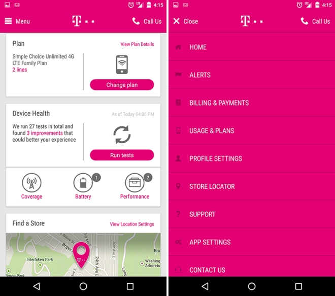
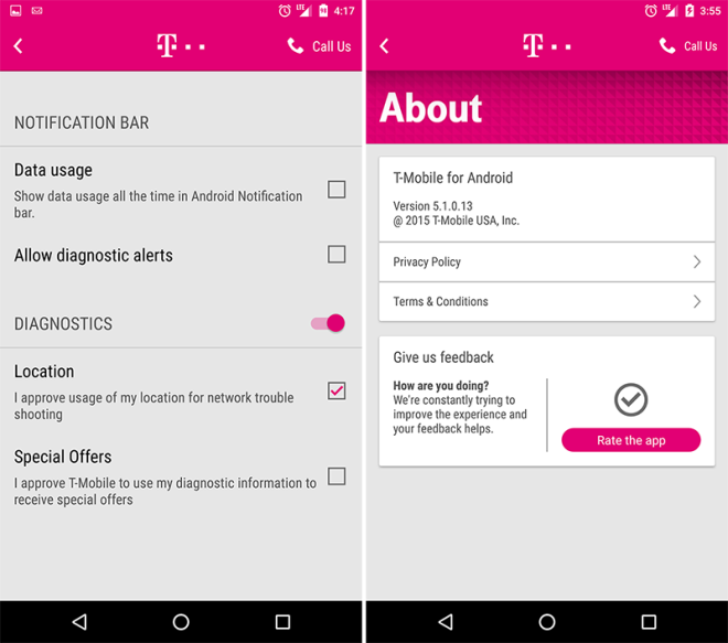
Reddit user dsulli37 has posted several screenshots of the new T-Mobile app for Android in action, and I have to say, it looks pretty darn good. There are cards that display information like your bill amount, usage, and so on that give off a bit of a Material Design vibe, as well as a hamburger menu for jumping between the different sections of the app. To compare, here’s what the current app looks like.
As expected, the app has sections for changing your plan, paying your bill and EIP, checking your usage, finding a store, and more. You can also check your device’s health, and the app will suggest improvements that it thinks will “better your experience.” You can also use the app to find a T-Mobile store.
As I said before, T-Mobile hasn’t officially released this new app yet, so there are a couple of kinks in it right now. For example, one of the information cards just shows a big “3” inside of a circle. Exactly what’s supposed to be there is unclear, but I’m betting it’s not there because John Legere’s favorite number is 3. There are also some folks that are unable to actually use the app after installing it, with the app telling them “Unfortunately, the T-Mobile App is not yet ready for your account type.”
It’s unclear when T-Mobile might officially release its new Android and iOS apps, but if you absolutely cannot wait, this leaked Android app has been posted so that you can sideload it right now. Just keep in mind that this isn’t the official release, so things might be a bit wonky.
Since this is the Android version of the app, details like whether or not the iOS app will include Touch ID support are still up in the air. From what we can see in this leak, though, the new T-Mobile app is leaps and bounds ahead of the current offering. The new design fits nicely with current trends, and it appears to offer most features that you’d expect from a carrier app. Here’s to hoping that the official launch goes down soon so that iOS users can start using this new hotness, too.
Source: Reddit


