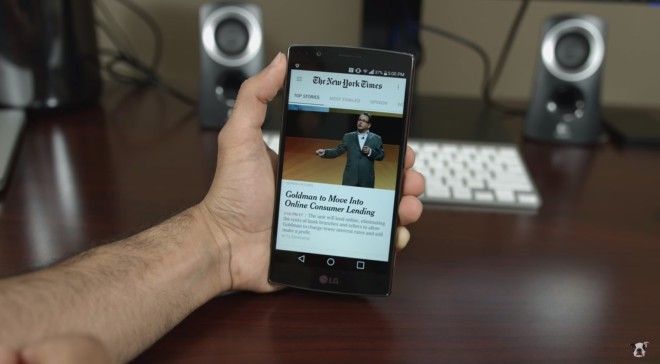
The New York Times recently updated its Android app to integrate the beauty of Material Design. They asked us to try it out and see the new, fluid navigation options of the updated app. It didn’t disappoint. This is a sponsored review of The New York Times App.
For years, The New York Times has been the number one source of for those who seek quality content. The new app showcases the beautiful Material Design integration. Compared to the previous version, the new update allows its readers to seamlessly swipe left and right to browse through different news articles. A simple swipe from the left also brings up the menu section, where an array of topics are available for the user to pick out one that interests them.
Besides Material Design, the update added a widget of The New York Times app. Through this widget, users can check out headline articles and other interesting topics directly from their home screen. When they see something interesting, the user can tap on it to be redirected to the full article on the app. The widget also comes in a resizable option, allowing users to make it fill the entire screen or shrink it down to a small portion.
This update proves how The New York Times manages to stand out from other news apps on Android. While it’s not as flashy as other apps available, it highlights what’s important—the editorial content. Articles on the newly updated The New York Times Android app are displayed in a distraction-free and clutter-free environment for users to easily read through. And with a few simple gestures, this update makes it the best version of the app.
The addition of Material Design made The New York Times app more enjoyable and easier to love. And since it’s free, you can download it anytime onto your device. Head on over to the Android Play Store to download the newly updated version of The New York Times app.


