“Never Settle”, a phrase which OnePlus has taken as its vague inspiration for a device that it wants to kill the flagship phones. Its production videos boast of a purposeful design, of no compromise and market-beating performance. But the reality doesn’t quite live up to those aspirations.
I’ve had plenty of time with the OnePlus One to bring you my thoughts on it.
Design
The OnePlus One design is a little unusual, to say the least. The device’s thin edges and curved back make it more comfortable to hold than most 5.5-inch+ smartphones, but it has some strange quirks about it.
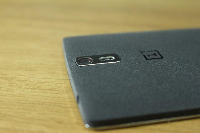
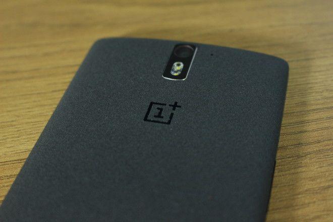
Firstly, there’s the sandstone texture on the black 64GB model that feels really nice in hand. And, at a distance, looks great too. But get in close, inspect it thoroughly and you’ll notice that the overall material quality is pretty cheap. And then there’s the strange decision to make the rear shell sort-of removable. It’s not as easy to pull off as a Nokia 3310 fascia. You have to take out the SIM tray, then try and pull the cover off using a combination of sheer force and black magic. Then you realize there’s no point since OnePlus decided not to bother making its wooden shells.

Another design decision I find odd – which may be related – is the chrome trimmed lip that surrounds the display. Again, from arm’s length, it looks really nice. Close-up, I had one of those “huh?” moments. It’s almost as if OnePlus took the front panel and display from a big Nexus and then sunk it in to a chassis that was too wide, too thin and too long. Instead of engineering a body that sat flush with the display, they went “that’ll do” and shipped it. It’s pretty bizarre.
As nice as the sandstone finish might be, you better be sure you don’t scratch it, or try cleaning it with your usual gadget wipes. The result: The same effect you get when you take your suede jacket out in the rain. It gets blotchy, and marked, and you should probably try and find a new cover.
Perhaps I’m being nitpicky. Although the materials may look cheap close-up, and the design is unusual (to me), overall, it’s decent. Out of the box, it’s one of the most unique looking and feeling devices on the market. My first impressions were very, very good. It’s only over time, and with closer inspection that I’ve become less impressed.
The build quality is sturdy enough, and the button placement is comfortable to get to. And I do love the overall minimalist approach to the way it looks. The capacitive control buttons on the bottom of the front panel are almost impossible to see when they’re not lit up. Which is a great thing. They also ensure your huge display real estate isn’t reduced by onscreen buttons. But if you want onscreen buttons, you can have them. You get the choice.
I also particularly like the OnePlus logo on the back, as well as the protruding camera and flash, placed dead center. There’s something very pleasing about the symmetry.
Display
The Full HD, 1920×1080 LCD panel on the OnePlus is admirable. We’ll get one thing straight: It’s not the best display on the market. But it’s still very, very good.
Perhaps the biggest draw is how content on the screen looks as though it’s floating on the surface. OnePlus has done a great job of making the LCD panel, backlight and touch sensor make-up really slim, bringing it as close to the surface of the glass as possible. Colors are accurate, and whites don’t give off any major noticeably discoloration. Contrast and saturation could be higher, but it’s not like the OnePlus’ display is completely devoid of life.
Thanks to its size, sharpness and viewing angles, watching content and gaming on the large 5.5-inch panel is a joy. Whites are nice and crisp too, so even browsing the web and reading ebooks is pleasant. I also found the touch sensors to be really responsive.
Perhaps my only complaint about the screen is that I wish it was a little brighter. It was difficult to see in daylight.
Camera
If there’s one area OnePlus really skimped on to save money, it’s the camera. There are much worse cameras on the market. But there are also much better ones. In most images I took, whether in daylight or low light, there was noise and visible graining. To add to it, colors are washed out.
Yes there are 13 megapixels. And yes, it can record 4K resolution video, but the results in both still and moving images leave much to be desired. Compare it to devices like the LG G3, Sony Xperia Z2 and even the iPhone 5s in photography and videography and it becomes very clear that – at least in this category – it’s not a “Flagship Killer”.
For a comparison between this and its nearest flagship rival, the LG G3, check out my PhoneDog video below:
That said, it’s not terrible enough that it should stop you from trying to get hold of one. If all you do is upload your pics to Facebook or Instagram, you really won’t care if the dynamic range isn’t as good as another phone, or if the exposure is a little slow to react to changing lighting conditions.
Performance + Battery
If there’s one area where the OnePlus does outshine its Android flagship rivals, it’s in general speed and performance. The 2.5GHz quad-core Snapdragon 801 series processor makes light work of everything.
Switching between apps, scrolling through lists, browsing the web and everything in between is fluid and stutter-free. And that’s mostly thanks to its clean and light user interface and lack of manufacturer bloatware. There’s nothing to clog up the device. No sill TouchWiz apps, or LG widgets getting in the way. It’s just a fine-tuned version of Android developed by Cyanogen to ensure the best in performance and the most open customization platform.
In fact, its performance and low maintenance OS was so refreshing, that for a good number of weeks, it became my go-to device. There was something so effortless about using it, and I loved that I could change the theme if I wanted to, and customize a lot of different aspects of the general user interface.
On the LTE/Wi-Fi front, it’s equipped with the fastest network technologies currently available in the U.S. And – more importantly – it’s compatible with T-Mobile’s most-used LTE frequencies. No band 2 (1900) love it seems.
The performance was further helped by the battery life. Its 3100mAh battery got me through at least a day and a half on a full charge with medium usage. Its screen-on time far outperformed the LG G3 I’ve been carrying alongside it. It’s not quite at the 2-day level of the Xperia Z2, but nevertheless, it should easily last you a full day of relatively heavy usage.
Wrap Up
The cliché overview phrase for the OnePlus “the best phone you can’t buy” is one I really wanted to avoid using in my review of the OnePlus One, but I can’t. All things considered, it’s a fantastic device for the cost. It might not be a flagship killer in every regard, but considering it costs just over half as much as a flagship, it certainly makes it difficult to justify spending the extra cash. At least, it would if you could just walk in to a store an pick one up. But you can’t. Until at least mid-October, you’re going to need to wait or ask for an invite. When and if you can order one, it’ll cost you $299 for the 16GB white model, or $349 for the 64GB sandstone black version.

