Apple iPhone 6 Plus – First impressions [Pics and size comparison]
Apple’s new iPhones are “Bigger than Bigger”, whatever that means, and while it might not apply so much to the 4.7-inch model, it definitely applies to the iPhone 6 Plus. I’ve had it in my possession for approximately 6 hours (at time of writing) and I have to say, I’m so glad I didn’t go for the smaller model. And just so we deal with the elephant in the room first.
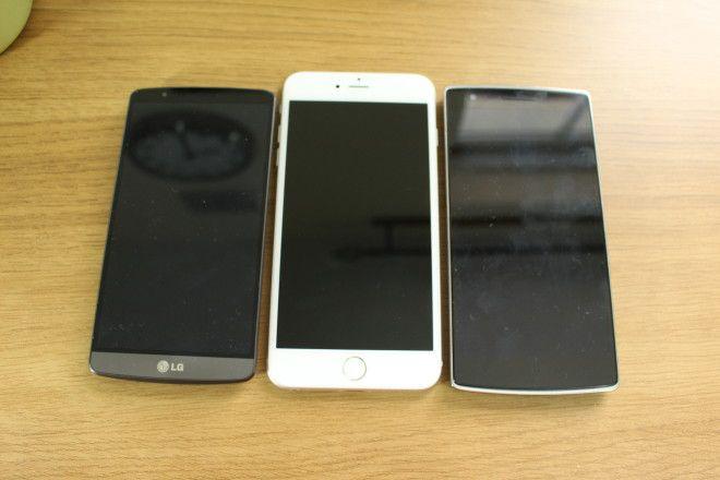
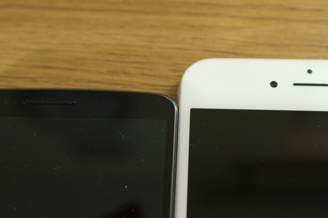
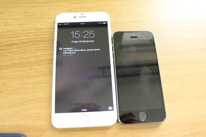
There are no two ways about it. Apple’s “phablet” is huge. It’s slightly taller than the OnePlus One, and much taller than the LG G3. Both of which have the same size display as the iPhone 6 Plus. And there’s a very simple reason for it: The iPhone has a home button.
But we were kidding ourselves if we thought it would be anything but big. That home buttons been on the iPhone since 2007, and now that Touch ID is housed inside it and such a big part of Apple’s future, it’s unlikely the home button is going anywhere soon.
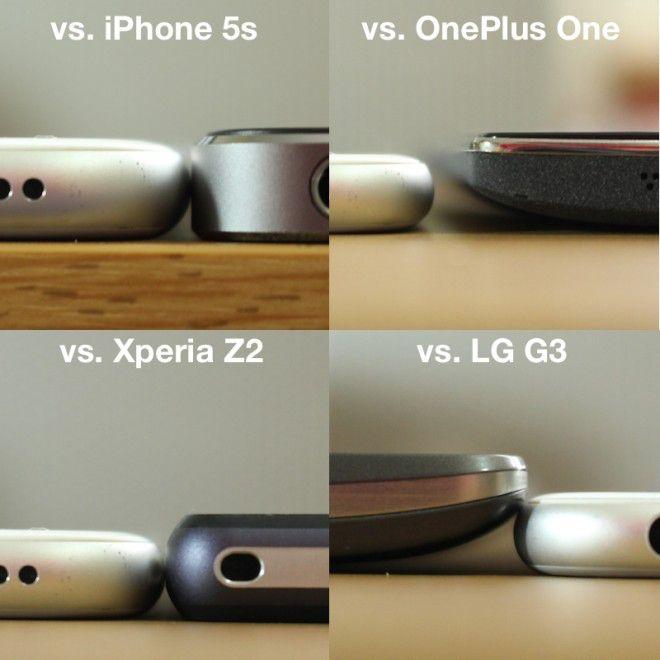
If you’re an Android user that’s used to big phones, you won’t mind it so much. In fact, you might prefer the way it feels in hand purely because of how slim it is. I shot its thickness vs. the Z2, OnePlus One, LG G3 and iPhone 5s. The difference between some of the thinnest Android phones and this is quite surprising.
If you’ve only use an iPhone, and never gone Android, you might want to try the 4.7-inch model first. The size gap between 5s and 6 Plus is – quite frankly – enormous.
Unboxing
As is customary these days, I unboxed the iPhone 6 Plus for on the PhoneDog YouTube channel. You can check that out here.
Thoughts on design
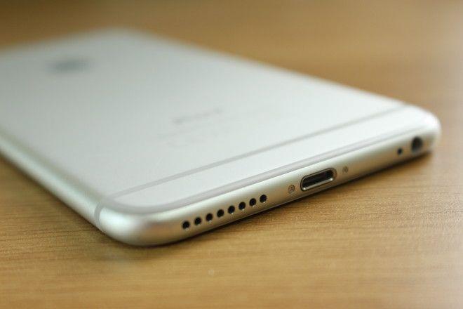
It’s no exaggeration to say that I’ve been longing for the flat metal edges to disappear from the iPhone since the iPhone 4 was announced. I’ve despised them since 2010. Finally, Apple’s done the sensible thing and rounded the edges which not only makes it feel more comfortable, but also gives the illusion that it’s even thinner than it is. For a phone that’s already this thin, that’s some achievement.
And unlike HTC – but very much like every sensible Android OEM – the power/lock key is placed on the right side of the phone. It’s easy to reach with your right thumb or left-hand index finger.
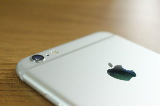
I’m not keen on the plastic bands on the back. They ruin an otherwise extremely classy look. The subtle curved glass at the edges of the front panel give it a really seamless finish, it’s like one continuous surface from back to front.
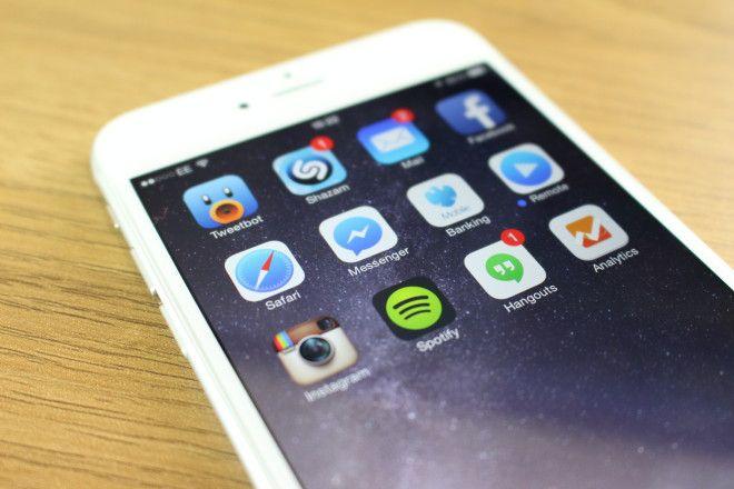
Apple’s done a lot of work behind the scenes to improve more than just the pixel count and size of the display. It’s a 1080p, 5.5-inch panel, but there’s a new thinner backlight, a new polarizer and a new sub-pixel makeup. What it means is that viewing angles should be better, colors more vivid, contrast higher as well as being better outdoors. And on first looks, whatever Apple has done has worked. It’s a far better display than what’s on the 5s. Further testing and comparison is needed to see if it’s better than its Android counterparts.
All in all, I’m mighty impressed so far. But there’s always that “honeymoon” or “new device” buzz that surrounds any product when you power it up for the first time. I’ll bring you my full thoughts on the device in a couple of weeks or so. Once I’ve lived with it properly.

