Nokia Lumia 635 – first impressions
This week finally saw the arrival of Microsoft’s latest budget handset, and I got my hands on the international, unlocked GSM model. It’s the first phone to ship running Windows Phone 8.1 which features some nifty new features like Action Center, the Android-like drop-down box for notifications and quick access toggles. There’s also the new Flow keyboard, which is similar in style and performance to Swype/SwiftKey, and Cortana, the digital assistant.
I’ll make it clear outright, because I’m in the UK, I don’t get access to Cortana. Microsoft hasn’t made that available on this side of the pond yet. And that was something I was really looking forward to trying out. [Insert appropriate glum-looking emoticon here.]
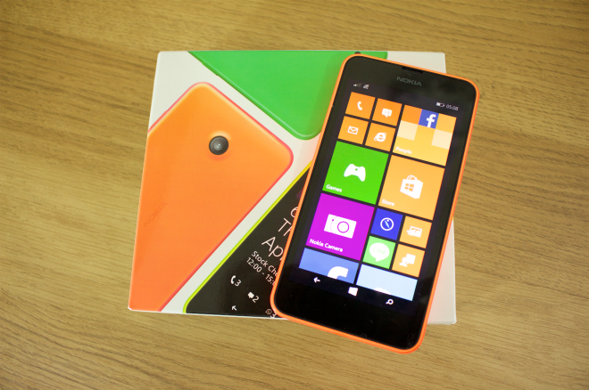
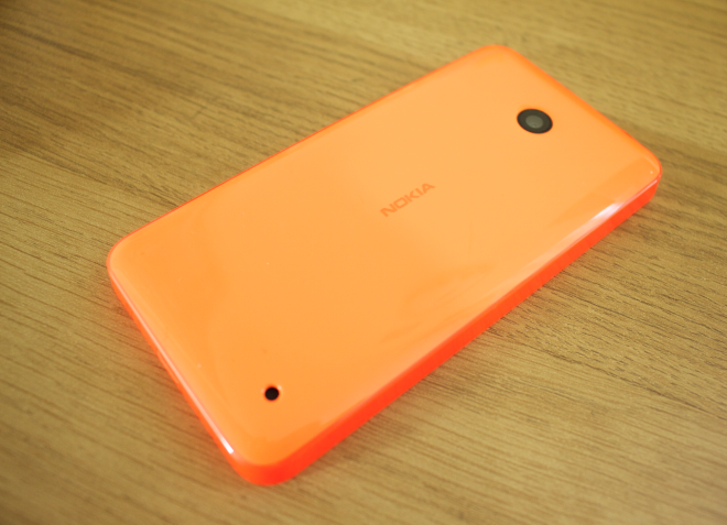
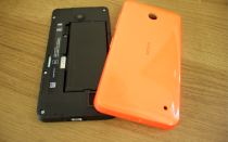
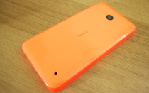
Apart from that, I’ve been fairly impressed by the 635 since I received it yesterday. Like most Lumia phones, it looks fantastic. Particularly in the bright orange hue I got my hands on. The edges have a vivid, translucent finish while the buttons and rear panel are a more solid, lighter orange. But what I like most is that, although it’s removable, the rear cover feels like a sturdy, unibody chassis. Those of you grossed out by neon-like colors will be glad to know that black and white options are available.
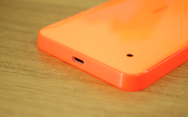
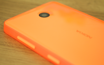
Despite being all “in-your-face”, the design is actually very minimal. On the front, there’s just a large, black, glossy glass panel surrounded by the bright orange frame. On the back there’s a camera in the center, and a small hole for the loudspeaker on the bottom right corner. The left side edge is completely free of any buttons or ports, the 3.5mm jack is on the top edge, the USB port is on the bottom edge and the power button and volume rocker are on the right edge. These are placed at a decent height, easily reachable with the thumb of your right hand or middle finger of your left.
Once again, it’s a case of Nokia showing us how well it does hardware. It looks and feels fantastic. And its specs aren’t too shabby either. The 5MP camera is okay, and the Cortex A7 based Snapdragon 400 quad-core processor has performed really well in some of the budget Android phones I’ve used recently (Mini 2, Desire 816, Xperia M2), but I’ll get a better idea on how it handles Windows Phone 8.1 in a week or so.
Just based on my first few hours, there are two disappointing features on the Lumia 635. First is perhaps the most noticeable: The display. At 4.5 inches, it’s certainly big enough. But with a paltry resolution of 480 x 854 pixels, it isn’t great. Text is noticeably fuzzy, and overall image quality is nothing like as sharp as what we’re used to from a smartphone. My point: If a Moto G can ship with a 720p panel, why can’t a Lumia 635?
But it’s not all bad, the ClearBlack technology does a great job of making blacks black, and colors are nice and vivid. The only other noticeable downside: There’s no front facing camera. In the year of the selfie, that’s a choice that makes no sense whatsoever. Not that I care personally, I very rarely use my front facing snapper. But it certainly seems like it’s cutting off a massive portion of today’s target market.
All in all, it certainly seems like a great phone. But I’ll bring my full thoughts at a later date, once I’ve spent more time with it.

