Google previews Android L, Android Wear and Android one at I/O 2014
Today, Google kicked off its annual I/O conference in San Francisco. Among the key announcements were the Android L developer preview, Android one and a much more in depth look at the new software for smart watches: Android Wear.
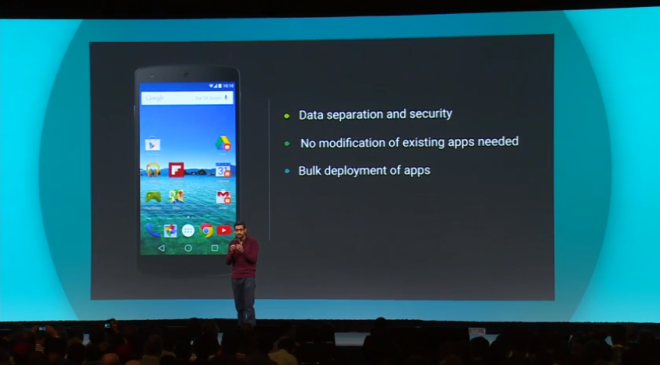
You might not see much of this, but Google today announced a new program named Android one. In essence, it’s a way to ensure a certain standard of hardware quality, and software compatibility and performance. So smaller third party manufacturers in developing markets like Asia, Russia, Africa and South America can source the right components for their devices and know that they’ll run smoothly and as intended on their devices.
Android one will also provide something close to stock Android, allow Google Play auto-installs and automatic updates. But Google’s biggest motivation here is creating the ability to have affordable hardware with a consistent experience across third party phones.
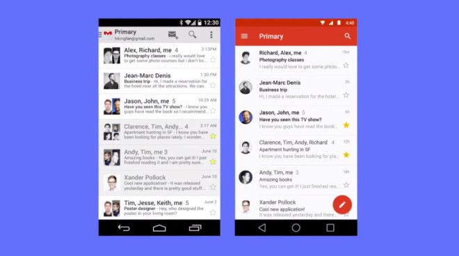
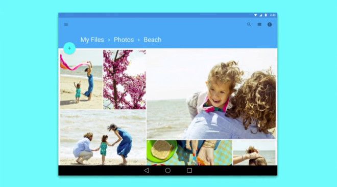
There was one distinct thread to follow through today’s entire announcement: Material Design. Android L is core to this experience. But it offers one consistent experience across all Android devices. It doesn’t matter if its desktop, tablet, mobile, wearable or even Android Auto (the newly announced in-car UI).
Material Design has a couple of key features. Firstly, apps and notifications will be built upon an adjusting paper/card-like user interface. It offers up realistic lighting and shadow effects on layers of apps. Switching between apps, and layers within apps is all fluid and snappy. Even pressing icons and buttons on screen creates a natural and attractive animated buttons. All added with the aim of making using Android easier, and more intuitive.
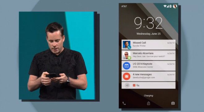
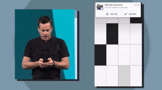
As a whole, Android L comes shipped with over 5,000 new APIs, most of them were completely ignored today, and many just got really brief mentions. Android L also comes with a new phone dialer, contact list and new version of other default apps like Chrome, all built upon the “Material” program. There are new lock screen notifications which can expand, or be dismissed, and organize themselves based on priority. You will also get new dismissible notifications on screen when you’re using any other app. You can simply swipe it off the screen or accept a call – for instance.
Unlocking your phone with Android L is also a little more contextually aware. For instance, if it can detect your Android Wear smartwatch, it knows that you are the person trying to unlock the phone and so it won’t ask you to input a PIN or pattern unlock. If it doesn’t detect your watch, it will ask you for PIN/pattern code unlock.
For the more geeky among you, you’ll be glad to know Google’s also been hard at work behind the scenes to make sure Android L makes the most of your device’s CPU, GPU and battery. The ART platform is 64-bit compatible, and can bring console-quality graphics to your tablet or phone. Also, Project Volta has some really cool code that creates a detailed battery historian, a “JobScheduler API” which enables developers to create a set of tasks based on certain criteria. Like – Download updates when phone is plugged in. And, similar to the LG G3’s built-in battery saving tech, it can reduce screen refresh rate depending on what you’re doing.
There’s a lot more to Android L that we weren’t shown. And I can’t help but feel that the unannounced stuff is going to make a massive difference to developers, which will eventually feed down to the consumer experience.
Android L developer preview will be available from tomorrow. It’s going to be launched as public release this fall (most likely alongside the next Nexus phone).
Alongside Android L, Google also showed off more in-depth demos of its Android Wear smartwatch platform and announced that the LG G Watch and Samsung Gear Live will be available later today from the Google Play Store. Moto 360 will be available later this summer.
We also saw a new in-car experience named Android Auto. Basically, iOS in the Car but for Android. It creates a custom on-screen user interface in your car’s main dash screen, controlled from your phone. But like I mentioned earlier, it’s clear that all these different screen sizes: Car, Watch, TV, Chromebook and more will have the same Material Design.
On the Chromebook side, Google’s done more to make a continuous experience between your phone on your Chromebook. You can answer calls, see incoming notifications, and bring mobile phone applications to your Chromebook.
All in all, in one event at Google I/O, the company has made a strong move to take over your entire lives. In a good way. If it has its way, it will have its ecosystem wrapped around you wherever you go. Whether it’s on your TV or your watch, Android is there.

