Moto X Review: Motorola’s First Smartphone On T-Mobile In Years
For a long time I’ve wanted to get my hands on an Android smartphone that is the right combination of size and specs. Many might (and will) argue that the Moto X doesn’t hold up on paper to the Galaxy S 4 and HTC One, but in my real-world experience it’s just as good. It remains very unfortunate that, for whatever reason, T-Mobile has decided not to offer, at least initially, the Moto X through their own retail channels. Currently, the device is only available through Motorola.
That begs the question of whether T-Mobile and its retail partners will continue to work to bring the no-contract equipment installment plan option to all sales channels. And there are other unanswered questions about how T-Mobile and Motorola will sell the Moto X. (As of yet the carrier has made no public announcements on the matter).
Suffice it to say that, for the purpose of this review, I used an AT&T Moto X variant. That means no T-Mobile speed tests or T-Mobile specific related signal tests, call quality etc…otherwise the hardware and software should be the same. So, without further ado, the Moto X.
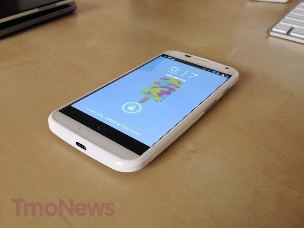
My favorite aspect of the Moto X? Its hardware body. I won’t hide my adoration for Motorola’s approach. The device seems best designed to conform to the hand, 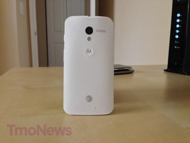 and it feels positively great. There’s no question Motorola can produce top-notch hardware, and even if the actual material doesn’t feel as “high-end” as the HTC One, I never felt the device was going to break, fall apart or melt in my hand. It has a soft material touch against the more plasticky Samsung or aluminum HTC One.
That said, the Moto X won’t stand out in a crowd. It’s not a conspicuous design, and that’s a good thing. Motorola hasn’t revealed exactly what materials comprise the Moto X body, which means it’s probably adamantium.
Jokes aside, the Moto X arrives at 10.4mm at its thickest point and slims to 5.6mm at the edges. The 4.7in 720p display takes up around 70-75 percent of the front of the device, but it comes in a package that feels and is far smaller than the same 4.7in display on the HTC One. The 2-megapixel camera, earpiece and ambient sensors take up the rest of the front, with absolutely no branding. (Hooray for that last part).
On the rear of the device rests the 10-megapixel “ClearPixel” camera with LED flash right below it. The speaker sits to the right of the camera and the Motorola “M” logo is dimpled right below the camera. For whatever reason Motorola went with the addition of a dimple, it seems like a natural place to stick your pointer finger when talking.
The volume rocker and power switch rest on the right-hand side of the device. I wouldn’t call them the most solid design, at least not the volume rocker; it had a slight give in my review unit. 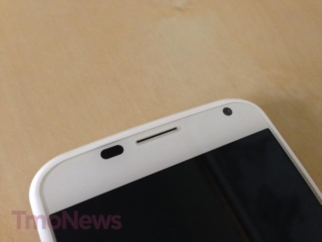
The 3.5mm headphone jack is on the top of the device, and I hate that it is. I don’t know why, but for me the natural placement of the headphone jack should be the bottom of the device. You might disagree, but I find headphone jacks on the top of any smartphone to be irritating.
The left-hand side of the device is where you will find your nano-SIM tray, which requires the paper-clip like tool that arrives in your Moto X box to open. The Moto X is the second device to arrive in the US with the nano-SIM; the first was Apple’s iPhone 5.
There are no hardware buttons on the Moto X. With the Android soft keys, the front of the device is clean and smooth. As for that 720p display? In a world where 1080p is becoming more of a norm in “flagship” handsets, the average user will never notice. The AMOLED 720p display packs in 316ppi and looks great. Viewing angles are hardly affected and colors pop. Unless you absolutely, positively must have a 1080p display and the resulting impact such a display has on battery life, the Moto X will suit you just fine.
The Moto X software is inconspicuous, yet nice enough to bring complete satisfaction. To the chagrin of many, the Moto X arrives out of the box with Android 4.2.2 and not Android 4.3. Remembering that Motorola is a Google company, I really can’t see why this device arrives without the latest Android software. Still, you get a nearly pure version of Android 4.2.2 Jelly Bean. It’s almost identical to stock Android, save for some customizations Motorola made to the camera UI, notifications and a few other voice-command functions.
It’s these Motorola-specific additions that set the Moto X apart. While we’ve already seen these features duplicated by various developers, Motorola has a leg up on the competition right now. That brings us right into Active Display, or as Motorola describes it:
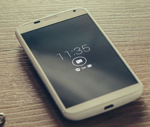
Knowledge is power, and Moto X gives you just that – at a glance. It always displays what you need to know, when you need to know it. Information quietly appears on the screen, so you don’t have to wake it up to look at the time or see your messages. Before you know it, that itch to check your phone will be gone forever.
That’s pretty much exactly what it is, and it’s wonderful. While locked, the middle of your display will show new notifications and an icon to unlock the device. Motorola calls them “battery-friendly notifications,” which circles back to their X8 core hardware story. Active Display won’t appear if the phone is in your pocket or purse, face down or on a call. It will, however, allow you to manage which icons appear and when they show up or prevent them from showing up altogether. Is Active Display a novelty? Sure. You don’t NEED it, and it won’t make the difference between choosing the Moto X and the Galaxy S 4. But it is neat and functional.
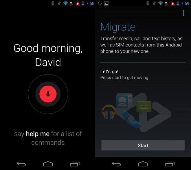
Next up is Touchless Control, or the feature that kicks in every time you say “Okay, Google Now” to your phone. It’s a nice addition. Some are already calling it gimmicky and finicky, but it’s definitely a look at what’s to come from Android in the future. I’d be shocked—shocked, I tell you—if we didn’t see this arrive on more smartphones in the very near future. Setting up Touchless Control requires you to be in a very quiet room and repeat the phrase “Okay, Google Now” several times. If you can push through that, you can make calls, launch apps, send messages, set alarms and reminders, find directions and more. It takes a moment to respond–more so than just the standard Google Now approach–since the phone has to queue Now first. Still, the extra second is worth the wait just for the sake of not having to touch the device. There’s been a number of times when the phone has been next to me while I’m playing with my little one and said “Okay, Google Now, remind me to take a nap in one hour.” It’s a fun feature that will hopefully get better and hit more devices over time. In fact, it may find itself as a decent use case scenario for hands-free while driving. You could vocally transcribe a message without taking your eyes off the road or your hands off the wheel.
Motorola also packed the X with Migrate and Assist. The first is an app that installs on your previous smartphone and allows you “transfer media, call and text history, as well as SIM contacts, from this Android phone to your new one.” I had previously been using an HTC One, and Assist worked very well. Of course, I’d like it transfer everything, including my home screen setup. But that’s just my Android dream. There are already some apps that do this, like Helium, but a built-in application would be excellent.
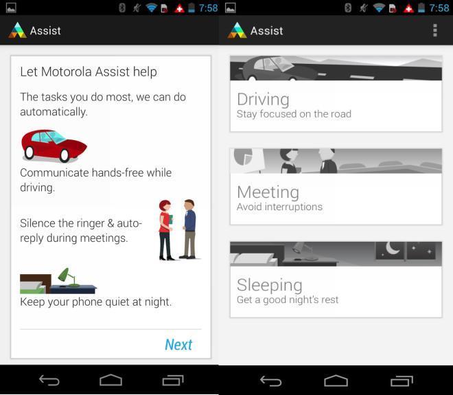
That leaves Motorola Assist. With this app, Motorola helps you be a safer driver. Moto X knows when you’re driving. It can read out who is calling or texting, so you can keep your attention on the road. Driving mode is enabled using the accelerometer and GPS to detect when you’re behind the wheel. Then, the phone will then read your messages and phone calls through the speaker. For the most part I found it to be useful, but there’s still some tweaking Motorola could do.
Cores. That seems to be the word we focus on with every release. When push comes to shove, how a phone performs is more important the one part of its makeup. Yet, te X8 architecture makes the Moto X a very unique device for Motorola. First, let’s highlight that the Moto X combines a dual-core Snapdragon S4 Pro working at 1.7GHz, quad-core Adreno 320 GPU and two additional specialized cores. This second set of cores is used for two purposes. One is used for natural language processing (“Okay, Google Now”) and the other for contextual computing. The Moto X’s 2GB of RAM help to make sure the device runs buttery smooth. The two additional cores power the Moto X specialized features like Touchless Control and Active Display. All of this is designed to prolong your battery life while providing excellent real-world performance.
Motorola has made something out of the idea that the industry needs to refocus on real-world performance, and not on-paper specs. Motorola’s newest device doesn’t hit the same benchmark numbers as the Galaxy S 4 or HTC One, but that’s okay. The bottom line is that performance is good. Not only that, but I really didn’t notice a difference between the HTC One, the device I had put down to use the Moto X.
Given Motorola’s hype of the ClearPixel experience, I expected more out of the camera. With early reviews already panning the experience, I had low expectations going in, and to some extent, they were right. The camera isn’t horrible; it is better than the Nexus 4. But if a smartphone camera is your top priority, look elsewhere.
You can jump into the camera through a quick flick of the wrist, or you can go straight into the app through the menu. The Moto X features the company’s “ClearPixel” technology. Motorola says that their ClearPixel tech “collects more light and snaps pictures up to twice as fast as other phone’s cameras. So it can capture the darkest scenes or stop motion blur in bright light.”
I’ve said it before, and I’ll say it again. I’m not a professional photographer, and I don’t have a good eye for white balance, purple fringing, “soft” pictures or any photo jargon. What I care about is how a shot looks to my naked eye. Even there, I can tell you the Galaxy S 4, HTC One and the iPhone 5 are far better choices if a camera is high up on your list of reasons to buy a smartphone.
Shots will look a little better if you stick to HDR. Outdoor shots at close range are good, but the further out you go the worse off you’ll be. Macro shots are good, and in some cases even better than other devices I mentioned earlier. However, don’t even bother zooming in all the way for shots; you’ll be sorry you did. As for that 1080p video recording? It’s manageable, but I wouldn’t consider it to par with other devices selling at the $199 price point. One bright spot is the audio playback. It works very well, thanks to Motorola’s three noise-canceling mics.
On the flip side, Motorola has presented us with a unique and simplifed camera app. The shutter button is gone; the entire screen is now the shutter button. That means that the device is already set to autofocus. You might be used to pressing the display to focus, but if you touch the screen once you’ve got yourself a picture. This may lead to deleting a few accidental shots, but the idea itself is pretty nice if the phone does autofocus properly.
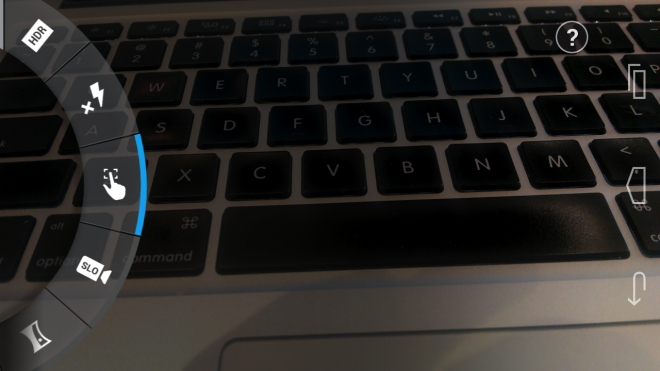
You are left with two on-screen buttons: one to shoot video and one to switch to the front-facing camera. Swiping from the left will bring out the circular menu, which features HDR, flash, tap to focus, slow-motion video, panorama mode, location-tagging, shutter sound toggling and “Quick Capture.” This menu is very well thought out, and I hope it’s something we see more manufacturers adopting in the future. (Looking at you, Samsung).
Here’s the silver lining: Most of the issues seem to be related to software, and that’s something Motorola can improve down the line. If Motorola can fix the issues, this could be a top performer. The Moto X certainly has the goods. But right now, I’d put the Moto X firmly in the middle-of-the-road for smartphone shooters.
With a 2200 mAh battery, you might expect the Moto X to be just another smartphone with so-so battery life. But Motorola claims users will get 24 hours of all-day-use. This is supposedly supported by their X8 architecture. Still, for most power users, that sounds completely impractical.
I consider myself a power user. Tweeting, browsing, emailing and messaging all day still allowed me to push through 7 a.m. to 11 p.m. without burning through the battery. If you start messing with signal or you have the chance to play on WiFi most days, that will affect your battery for better or worse. (A phone struggling for signal or bouncing between HSPA+ and LTE all day will surely drain faster).
Motorola’s Active Display is designed to save you battery by allowing you to get information without actually jumping into the phone. You can check the time and see notifications without actually powering up the display, and that’s useful for extending battery life. However, the DROID MAXX this is not. Twenty-four hours of real-world use won’t happen, but I found it to be better than either the Galaxy S 4 or HTC One.
Motorola has also built in their Motorola Connect feature, which ties your computer to a Chrome extension. You can see incoming calls, missed calls, voicemails and text messages all from your computer. One of the reasons I love my iPhone is the opportunity to iMessage all day from my MacBook Air. Motorola Connect takes it a step beyond iMessage, and it’s awesome.
There’s also “Motorola Skip,” a clip that attaches to your clothing. When you pull your phone out of your pocket, you can “unlock your phone with a single tap.” Okay, so unlocking is a bit easier than just swiping on the display. But without any real-world experience with the Skip, it seems like more novelty than necessity.
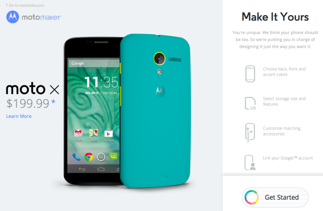
And then there’s MotoMaker. MotoMaker is one of the coolest options we’ve seen from a smartphone OEM in some time. Want to make a uniquely styled smartphone? Buy the Moto X and use MotoMaker to design it the way you want. Unfortunately, this is exclusive to AT&T right now, but it will be coming to other carriers “soon.” It’s an awesome way to personalize the style of your device using various hues from cool to neutral to warm. Personally, I’d go with a turquoise back and white front. What can I say? I live in South Florida, so turquoise and white would fit right in with the art deco style. Motorola says there are 2,000 possibilities for you to create by mixing and matching all the accents, front and back colors, wallpaper, memory and matching accessories. Will designing the phone with a unique personalization color scheme be enough to convince you to purchase it? Maybe. It’s something we haven’t really seen much of in the industry. It’s cool, but not a “must have.”
As a mostly-stock Android experience, you don’t get anything that resembles TouchWiz or Sense UI. Save for a few pre-installed AT&T apps and the death star logo on the rear of the device, it’s mostly free of branding. I imagine the T-Mobile edition, however it’s sold, will also come with some pre-installed software and T-Mobile logo. But again, it should be 99 percent pure stock Android.
Ah, the Moto X. You are a mystery wrapped in a riddle. I want to love you, and I do love your form factor. But I just can’t get behind your camera. Hardware-wise the Moto X is my ideal Android device, even if it doesn’t play the pound-for-pound spec game against the likes of the Galaxy S 4, HTC One and Xperia Z. And then, the MotoMaker personalization option will be fantastic; it certainly adds a little intrinsic value.
The bottom line is that the Moto X runs everything as well as other top-notch Android devices out there. It’s hard not to compare the device to the Galaxy S 4 and HTC One, thanks to its $199 price point. However, if this phone were priced at $99 or even $149, it would be a ridiculously good deal.
The real problem with the Moto X is how it compares on paper. It’s unfortunate that many who might otherwise enjoy the phone will be moved toward other devices because of that. Specs don’t and shouldn’t matter anymore, and emphasis on quad-core, dual-core, Snapdragon, NVIDIA and all of that is just nonsense these days. There is far too much emphasis on specs in a world where most Android devices (barring the entry-level) will be more than adequate for daily tasks.
The end of the discussion is that Motorola has a perfectly capable smartphone on its hands. Plus, you can buy a wood-back variant sometime later this year when MotoMaker is open to all. Seriously, a phone with a wood back? How can you say no to that?

