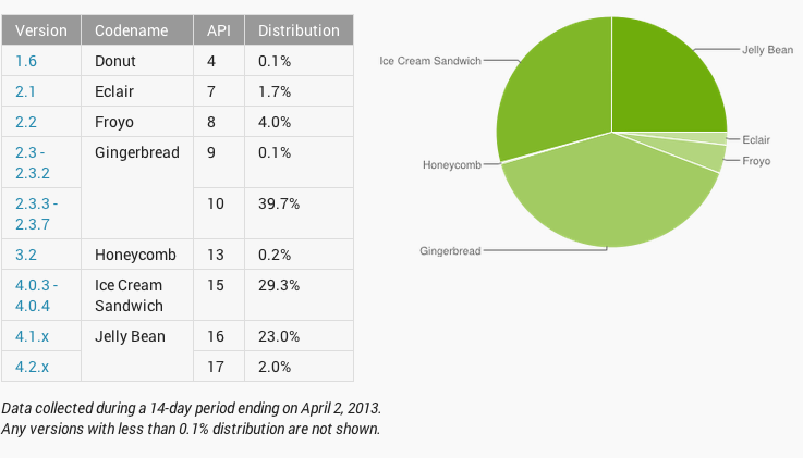
New Android Distribution Chart Released As Google Changes To Counting Active Users
We look forward to Google’s Android distribution each month to see just how much growth the newest Android releases gain. Starting in April, we’re going to see a whole different way of keeping track of devices as the developer team announced via Google+.
The new device dashboards are based on the devices of users who visit the Google Play Store (rather than devices that have checked-in to Google servers). As a result, the dashboards more accurately reflect the users most engaged in the Android and Google Play ecosystem—and thus most likely to download and use your apps.
Up until April’s chart, distribution numbers were calculated based on devices checking-in to Google servers, but now numbers will be based on vista to Google’s Play Store. The result Google says is a more accurate reflection of the users actually engaged in the Android ecosystem and “thus most likely to download and use your apps.” With the changes in place, the new numbers show a large jump in Jelly Bean use (Android 4.1+) to 25% from 16.5% from March. The changes also helped lower the number of devices running Froyo and Gingerbread down 3.6% and 4%, respectively.
Now, there are some differing minds interpreting Google’s changes wondering whether these numbers don’t help Google “game” the system a little. For developers, it’s definitely a help as they get a clearer look at the various types of Android and where the users are with hardware. In other words, developers will have a better opportunity to concentrate their efforts on where the most active users are, and not where the most users were hitting Google’s servers. The flip side is that Google’s competitors have often used these numbers as a way to attack Android’s “fragmentation” issue. With these changes, Google eliminates some of the competitive freedom to hit them, so it’s a win-win for the Goog.
Android Developers, Google+ Android Developers

