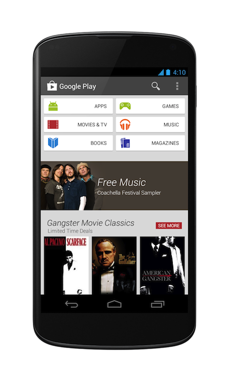
Say hello to a “fresh new look” for Android’s Play Store as it was just unveiled by Google. The rumored redesign starts rolling out now for both Android phones and tablets. The new design has been engineered to focus more on bigger images that will jump right out at you. Google has grouped similarly themed content together so you can better find that magazine or app to read or try.
Scrolling down a little more on the homepage of the new Play Store you’ll find new recommendations continuing to appear to help you explore and discover. Purchasing has also been simplified to help you move right through checkout and get right down to enjoying that book, movie or other content.
The redesign starts its rollout today for Android phones and tablets running Android 2.2 Froyo and above. The rollout will be staggered over the next few weeks, but fear not as Google will have it on your device real soon.
What do you Android fans think? Is this not a much improved look to the Play Store?

