TmoNews Reviews The Nokia Lumia 810, How Does It Stack up?
Windows Phone 8 is an interesting piece of technology for me as it is a system I want to love, try to love and end up just indifferent about. As I’ve had both the Windows Phone 8X and Lumia 810 hanging around my desk, I’ve come to appreciate both Nokia’s WP8 specific apps and the appearance of the Windows Phone 8X. The problem is I just couldn’t use either as a daily driver since the the market lacks any real depth. I wish I could say something otherwise as I’ve been preaching for months how I’d like to do a 30-day trial of the Windows Phone 8. I want to do it but the problem is I can already guess the result. I would love the apps that are available, but there wouldn’t be enough of them to make me switch full time. Therein lies the problem with the Lumia 810 and my upcoming review with the Windows Phone 8X. I’m trying so hard to like them that I’m being particular about their shortcomings.
Hardware:
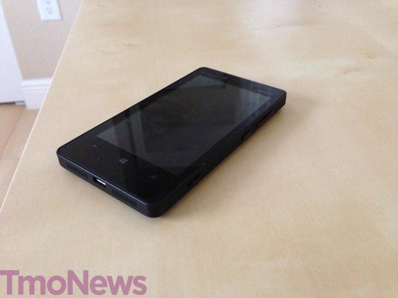
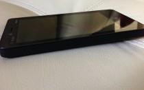
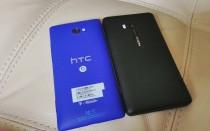
I won’t pull any punches on the Lumia 810 body. It’s unattractive, bulky and it feels more like something I want to toss at a criminal trying to pickpocket me than a device I want to call my parents on. Phew! I’ve been waiting to say that. Still, ugly looks aside, there’s a powerful phone inside and one that is worthy of your attention — if you can get past the exterior and the heft of the phone.
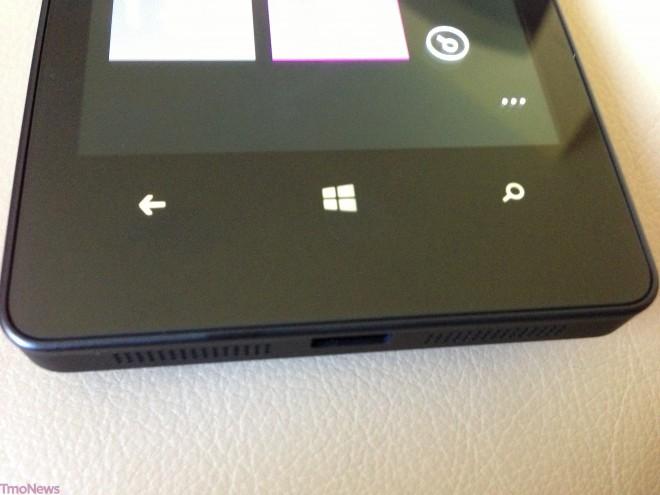
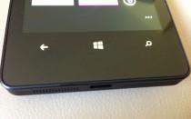
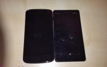
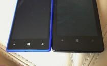
On the flip side, that same heft makes the phone feel solid and sturdy and ready to take on the world. I wouldn’t qualify the Lumia 810 as rugged, but I feel a lot more comfortable dropping this device than I would the Nexus 4. The problem with the hardware appears to be wasted space and a whole lot of it. That’s especially true when you consider the amount of real estate between the very bottom of the display and the actual bottom of the device. There’s slightly less than an inch gap between the display and the edge of the phone with buttons that take up less than ¼ of that. It’s a design decision I’m certain, but what kind of decision and what kind of design I have no idea. I wish I did because I feel like there’s a lot that could have been done to streamline the look of the phone, at least in regards to this specific portion of the front of the device.
So here’s the problem. The Lumia 810 has a 4.3” display and is 2.69” wide, while the Nexus 4 has a 4.7” display and is 2.7” wide. Granted, it’s all about height and width and is the display taller or wider, etc, but it’s incredibly noticeable in the case of the Lumia 810. The bottom line? There’s far too much space around the bezel and again, especially toward the bottom of the device. However, the display itself is an OLED 800×480 which is fairly good overall and I didn’t have any complaints. Nokia’s Clearblack technology makes for slightly easier outdoor use.
Continuing with things I like about the Lumia 810, the hardware is paired with a 1.5GHz Snapdragon processor that never stuttered, lagged or otherwise made me feel the phone couldn’t handle anything I could throw at it. Granted, I don’t download nearly the same volume of apps I would if there were an Android or iOS device app store available, but I never felt like I was asking for trouble or pushing the phone too hard. WIth 8GB of built-in storage, there’s enough internal storage to cover your app needs, though I’d suggest keeping an eye on what you’re downloading.
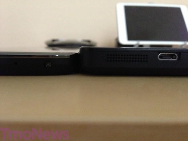
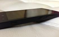
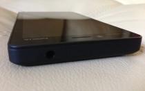
Like all Windows Phone devices, there’s a dedicated camera button on the right-hand side of the device, along with a volume rocker and power button. The left-hand side of the Lumia 810 is empty. The rear features an 8 megapixel Carl Zeiss lens with built-in flash. The top features the 3.5mm headphone jack with the microUSB port for charging and connecting to a PC available at the bottom.
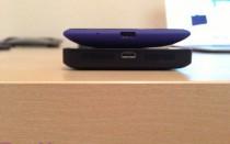
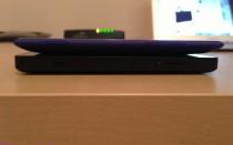
All in all, the hardware feels incredibly solid which may be my biggest issue with the 810. If Nokia had billed the Lumia 810 as military grade or indestructible, I’d have greater appreciation for its size, but in a day and age when “thin is in,” going thicker for what seems like wireless charging reasons doesn’t make me feel all warm and fuzzy inside. Wireless charging is a fantastic future, but for now it’s just a novelty and I’m not sure I’m ready to sacrifice even a little extra heft for a half-baked technology.
General Usability:
Software –
It’s hard to talk about the Lumia 810 or my upcoming review of the Windows Phone 8X without really delving deep into the Windows Phone 8 experience and how that differs from that of Android and iOS. If you had asked me two months ago, I was a big, big fan of what I had hoped Windows Phone 8 could accomplish. Now, I’ve tapered my expectations and understanding of where Microsoft has been and where they are going. As I go back to this review after a few days, reports comes out that Google has no plans to make apps for Windows Phone 8 or Windows 8. Now, Windows 8 may be another story as adoption is forced upon just about everyone buying a new computer, but the same can’t be said for smartphones.
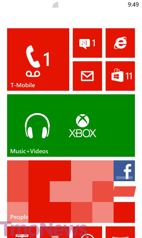
Overall, Windows Phone 8 is a smooth operating system that looks beautiful and functions as well it looks. The overall problem isn’t lag or hardware or even the overall software. It’s the apps or lack thereof.
I can’t emphasize enough that I want to love Windows Phone 8, I truly do. Which is why it pains me to say the lack of some major apps is not only noticeable, but it’s a deal breaker. Just look at the top free/paid apps on iOS or Android. It’s a venerable who’s who of the smartphone world. The top paid apps for Windows Phone 8 as of this writing include “Stop the Music,” “Human Japanese,” “Catholic’s Companion,” and “Cowlick.” Compare that to the top 5 Android paid apps which include Swiftkey 3, Titanium Pro Backup, Beautiful Widgets, FoxFi (Full Version) and Root Explorer. There’s such a gap in the app world between the top two operating systems and everyone else that it’s almost embarrassing to think that Microsoft would even want to promote “Cowlick”.
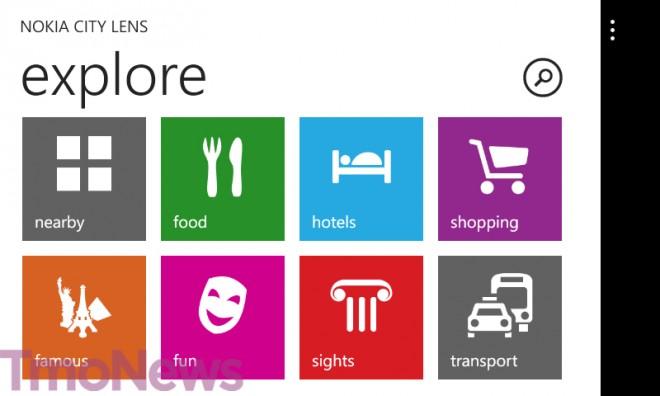
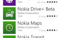
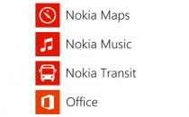
All that said, let’s switch gears for a minute as I do want to say something great about Windows Phone 8 and that’s the lack of bloatware. I criticize T-Mobile and Android manufacturers in general for the incredulous amounts of bloatware they still place on smartphones at launch. It’s true that Nokia’s Lumia 810 comes with a bevy of Nokia specific apps, but they are actually useful where most Android bloatware is not so useul. Apps like Nokia City Lens, Nokia Drive, Nokia Maps are fantastic and they add a certain flair to the Lumia experience, but if you don’t want them, deletion is just a two taps away. There’s a lesson here for Apple who won’t even allow you to delete its stock apps or Android bloatware that can’t be deleted without rooting.
I want to be clear that my frustration about the Windows Phone 8 experience doesn’t come from the apps themselves, but the lack of what’s available. Apps like Nokia City Lens are amazing, beautiful, functional, useful and something I wish I could put onto either Android or iOS in a mirrored capacity. Nokia knocked City Lens out of the park – it’s so awesome. Internet Explorer is a great browser and since alternative options are minimal, you’re going to love it even more. The photo gallery is beautiful and I could go on about everything that comes on the phone out of the box. So again, my concern about everyday WP8 use is what is available, it’s what isn’t.
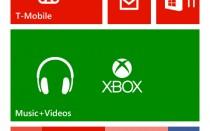
To spread a little more joy I’ll say there’s a lot about Windows Phone 8 to love including its minimalist look, live tiles, resized tiles and the fact that it’s completely unlike anything else on the market. Unfortunately, I could go on and on for hours about how the lack of apps really ruins the experience for someone like myself, a power user who cares about these things. Yes, there are unofficial variants of apps important to me like Dropbox, and Starbucks — but if neither of those companies are making any effort to release an app and you’ve got Google saying they aren’t bothering yet either, that is a serious issue. Microsoft needs to continue addressing this, even more-so than they already are if they want to get this system into the hands of a larger audience. Another problem I discovered after two weeks, if one can call it that is that even with all the live tiles, Windows Phone 8 ultimately is as boring as iOS. The lack of widgets and customization is something both companies will need to discuss if they want to stop the Android growth machine.
Battery –
Overall, the 1800mAh battery takes up a significant amount of space which I should add covers the microSD slot that you won’t find on the Windows Phone 8X. That may be reason alone to try the Lumia 810. Another reason is the average 12 hours worth of battery life I received. That 12 hours is a compilation of two Twitter accounts, one Evernote account, 4 email accounts and Facebook all working in the background to keep me up to date over the course of any given day. Moderate users can likely stretch their usage into a second day, but I’d recharge every night anyway. Unfortunately, I wasn’t able to test the wireless charging feature so I can’t say with any certainty if it charges faster or slower than standard wall charging. Still, battery life wasn’t a concern and I’d say the Lumia 810 was pretty well on par with the Windows Phone 8X.
Camera –
Note: Double click thumbnails for the original size.
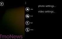
Nokia prides itself on having camera quality that is well above their competition. Especially during the launch announcement of the Lumia 920, Nokia made it a point to talk quality. I’ve often found that Nokia devices are a little finicky right out of the box and sometimes require messing around with feature settings to get that perfect shot. For Windows Phone reviews however, I tend to keep devices on auto, much to the chagrin of amateur and professional photographers everywhere because that’s what the average person does. The good news is that even in auto, the 810 does take some quality outdoor shots with very good color reproduction. There’s a definite lack of fine-tuning options compared to an Android device, but that’s really only something someone who delves into the optional features would recognize. If you really want to get the most out of your camera, you’ll have to tinker a little.
The Lumia 810 does lack the optical image stabilization of its older sibling, and therefore it doesn’t receive the PureView branding. It does still pack the same raw resolution at 8 megapixels and the same Carl Zeiss lens optics of the Lumia 920 and that’s a good thing. The camera is one instance in which the size of the Lumia 810 is actually an advantage and the “grippy” feel of the hardware helps to offer a stable grip. Bonus! Like all Windows Phone devices, there’s a dedicated camera button that jumps right into picture mode as soon as it’s held down. The swipe left function to enter the gallery is alive and well too and is a feature that is just so beautiful.
Overall, pictures indoors weren’t as detailed as those taken outside, but the LED assist flash comes to the rescue if the moment calls for it. The camera definitely isn’t the speediest and there’s no option for burst shots, something that I’ve become used to seeing on an assortment of Android devices. I wouldn’t rank the 810 as one of the better cameras I’ve tested lately and I’d give the edge to the 8X for overall quality, but the results are good enough to make sure you’ve caught the moments you care about.
Messaging –
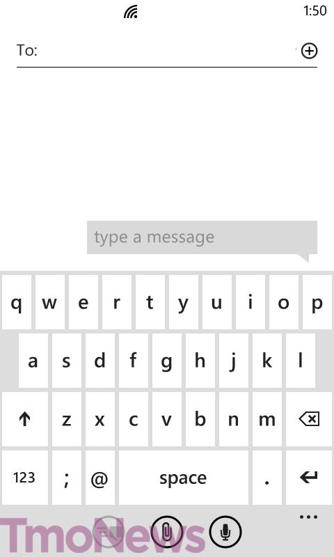
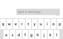
If there’s one area where Windows Phone 8 or even its predecessor with Windows Phone 7 excels, it’s in the keyboard. Messaging on the Windows Phone platform is amazing and the keyboard plays a role in 95% of that success. I honestly love it and it may even be my favorite keyboard right behind Swiftkey. It doesn’t have the predictability of Swiftkey and like iOS, you’re stuck with whatever Microsoft allows you to use, but that doesn’t take away from it being excellent on its own merit.
I know this review has teetered between some praise and some frustration, but let messaging be one area where I’m crystal clear. It’s fantastic. That’s it, there’s nothing else I need to say about it.
Network Performance:
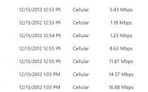
As far as performance on the T-Mobile network, the Lumia 810 generally performed slightly below where I usually see T-Mobile’s HSPA+ network perform. In my house I often see HSPA+ speeds upwards of 25, 26Mbps and that’s pretty standard for me. With the Lumia 810, I mostly saw half that and while that drop could be attributed to weather or various other factors, the bottom line is that it didn’t perform nearly as well as other devices I’ve tested.
On the call side, earpiece volume was adequate and callers said I sounded clear and they too sounded the same. Even if the speeds were a little slow, the 810 never wanted for a signal and held true to calls even if I dropped to one bar.
Over the course of the last two weeks I’ve never had any complaints about using the 810 as a phone and that’s very positive.
Wrap-Up:
So here-in lies my dilemma as I want to love the Lumia 810 and I want to love Windows Phone 8 and I expect plenty of you to shrug off my concerns over the lack of apps e and continue right along with picking up Microsoft’s newest devices. You’d be right to do exactly that. There’s plenty to love, but in my eyes and in my opinion, the pitfalls are large enough and wide enough to prevent me from using the platform full-time.
My angst over the size of the phone provides me with mixed feelings as I get the argument that the size is a differentiator and there’s a perfectly reasonable explanation for the thickness. Still, it seems like in Nokia’s haste to differentiate with wireless charging, they went against the grain of “thin is in.” Samsung seems to be setting the pattern with larger options and their competition save for Apple is following suit. Nokia seems to be going down its own path and it seems to be a risk they shouldn’t bother with now. Wireless charging is still a novelty and they should work on mind and market share before trying something brave.
I’d love to do a test where I put the Galaxy S III and the Lumia 810 in the hands of customers without telling them which operating system each phone runs and see which hardware people would rather use. Call me crazy, but I’m guessing the majority choose the Galaxy S III.
The good news is that the clean design of the Lumia 810 doesn’t take any chances. What you see is what you get. I know I’m beginning to sound like a broken record, but I’m having a hard time because I’m being pulled into two directions, wanting to love this phone and finding myself unable to do so. At the end of the day, if you can overlook the Nokia specific apps, some of which can be found on all WP8 devices, and wireless charging, the better camera and sleeker form factor of the Windows Phone 8X make it a better option.
The Lumia 810 is currently selling for $99 after a $50 mail-in rebate on T-Mobile.com.

