What Will A T-Mobile, MetroPCS Merger Look Like On A Spectrum Map?
While T-Mobile and MetroPCS execs played up the joint spectrum possibilities today, we’re curious as to what the actual spectrum makeup looks like on paper. Thankfully we have the folks at Moasik Solutions, a company that maps network coverage and they’ve provided the folks at GigaOM some nice visuals showing off T-Mobile and Metro’s network and spectrum holdings.
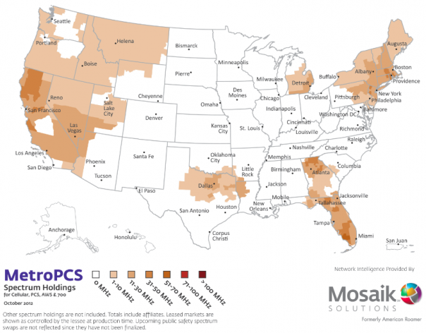
First up is a look at MetroPCS holdings, where their network is deployed and where they have spectrum assets that remain unused. While the map itself looks pretty blank in the middle, MetroPCS does have some large coverage in the West and Northeast, two large populous areas with many markets that will benefit from the combined company.
As was emphasized on todays investor call, Metro’s spectrum will enable to T-Mobile to offer a 20MHz boost in some major markets which will offer significant speed boosts that can double that of Verizon’s own LTE network.
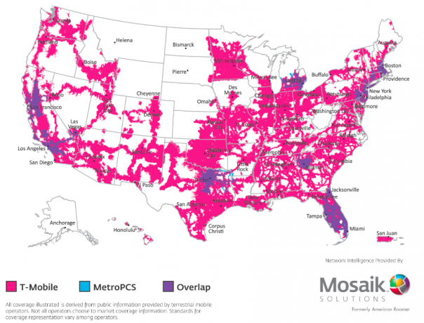
The second Mosaik map shows areas where T-Mobile and Metro spectrum assets overlap, and these are the companies live networks as opposed to areas where they are just holding unused spectrum. In other words, in these areas, where there is color, is where you should see a signal. It’s in the purple areas where T-Mobile’s network could see huge boosts in LTE network speed.
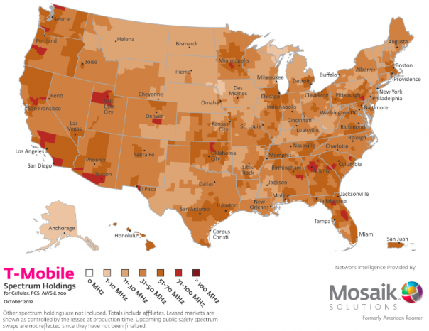
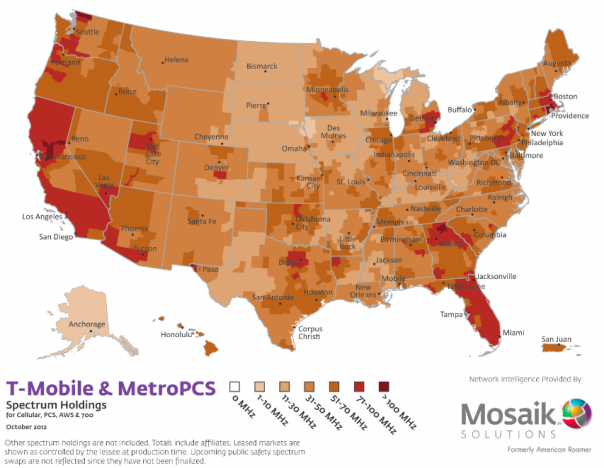
As for the last two maps, they should be viewed together and not separately as happens with the two earlier maps. The third map shows all of T-Mobile’s current spectrum holdings, without any layering from the MetroPCS merger. This is where T-Mobile both owns deployed spectrum and has unused spectrum holdings.
The last map is where the new company has combined network holdings, showing you the potential for what could come out of this merger network wise.


