TmoNews Reviews The Nokia Lumia 710
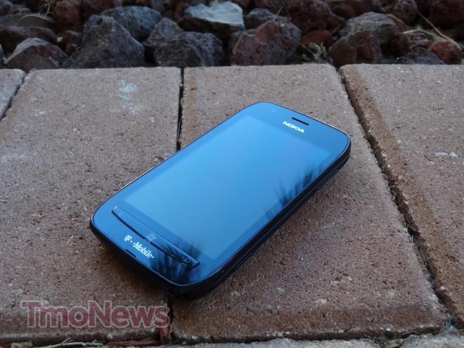
Ever since it was announced, I looked forward to reviewing the Nokia Lumia 710 Windows Phone 7.5 “Mango” smartphone, which arrives on January 11th to T-Mobile for $50. My expectations for Nokia hardware is always high and I have very fond memories of its cell phones from days gone by. There are days I’d happily rock a Series 40 Nokia 6230 and be the happiest T-Mobile blogger on the Internet.
All in all, I’m enjoying my time with the Nokia Lumia 710. In my own humble opinion, the hardware lives up to the Nokia of old — solid, sturdy and comfortable. This review is mostly two-fold: first is a look at the hardware itself and second is a fast look at Windows Phone 7.5, a topic we’ve already covered.
The thing about Windows Phone 7.5 is that it remains exactly like the review we did a while back, save for the Nokia-specific apps that are preloaded on the Lumia 710. As it stands, Windows Phone 7.5 is a tough sell. There are a lot of preconceived notions about Windows Phone. However, I remain idealistic. I believe that you can’t knock it until you’ve tried it, something many dissenters haven’t done.
Overall, I was very pleased with the hardware on the Lumia 710, save for the camera. I found the camera to be perfectly “average.” The camera wasn’t great, it wasn’t awful, it just worked. I definitely wouldn’t recommend this device over the HTC Amaze 4G if having the best camera in your pocket is your primary purpose for choosing a smartphone. We’ll get to that a little later, but let’s move on with the review now.
Specifications:
- 3.7″ ClearBlack display
- 1.4GHz Qualcomm MSM8255 processor
- UMTS 850/1700/1900/2100 support
- HSPA+ 14.4Mbps
- 8GB internal memory, no microSD slot
- SkyDrive cloud storage with 25GB of free cloud space
- 512MB RAM
- 1300mAh battery
- 800 x 480 display
- Corning Gorilla Glass display
- 4.4 ounces weight
- 4.69 x 2.46 x 0.49
- Dedicated power, camera, volume, windows UI keys
Pros:
- Excellent feel in the hand
- Single-core processor never slowed down
- Gorilla Glass display
- SkyDrive cloud storage includes 25GB free
- Good audio quality
- Excellent global roaming capabilities
Cons:
- Average 5 megapixel camera
- 3.7″ display could be considered too small
- Screen brightness was frustrating
- Nokia Drive navigation was equally frustrating to use
- Would have preferred capitative keys rather than tactile on front of phone
Hardware:
Every time I get my hands on a Nokia device, I just expect quality. I can’t emphasize that I’m a little biased toward its handset lineup because of the positive experiences I had years ago with its hardware. You can say whatever you want about Series 40, 60 and Symbian in general, but I never felt like Nokia made a cheap phone.
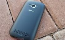
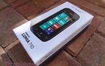
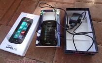
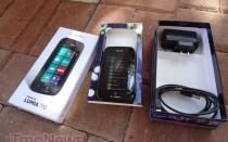
With those expectations, I was happy to see that the same level of care and quality in the 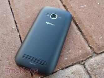 manufacturing of the Nokia Lumia 710. Solid was the first word that came to mind as I unboxed the Lumia 710. You can tell right away that the phone is well made. The back cover has no extra movement and everything just fits “right.”
The exterior casing of the body feels very good in the hand, with a little curvature around the sides. It doesn’t have a “boxy” feeling and almost conforms to your hand. One of the first things you’ll notice upon taking the Lumia 710 out of the box is how lightweight the phone is; it just feels “light.” When I reviewed the Samsung Galaxy S II, I felt it was “lighter” than my usual iPhone 4 staple but it didn’t feel as sturdy in the hand. However, the Lumia 710 feels lighter than both the Galaxy S II and the iPhone and considerably sturdier than the Galaxy S II and the iPhone. Incidentally, it is 0.3 ounces lighter than the GSII. Though, the simple point remains that the Lumia 710 is a much smaller phone with a 3.7? screen against the Galaxy S II 4.5? screen. So that 0.3 ounce weight difference is mitigated by the face that the Lumia is a much smaller handset. It doesn’t take away from the real feeling in your hand, though. It just feels “right.”
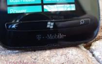
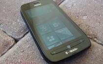
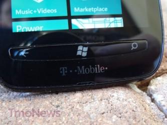
 The hardware itself feels like a cohesive part of the same whole, although the Lumia does move away from the recent round of Windows Phone hardware that had capacitive buttons by including those of the physical variety. The front of the device has a back, search and home button emblazoned with the Windows logo.
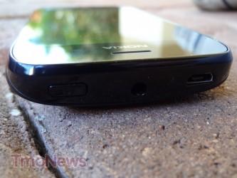
The right-hand side of the device has the volume rocker along with a dedicated camera key near the bottom of the device. When held in landscape, the camera key is in the perfect placement for the snapshot. I wish all handset manufacturers included a dedicated camera key on their devices. Apple, are you listening?
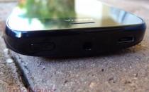
 The top of the device has the power switch as well as the microUSB port for charging and connecting to a computer. The left-side of the Lumia is empty with no hardware buttons whatsoever. The front of the device is composed of plastic while the rear of the device has a rubberized surface, which provides excellent grip in the hand. This is another sticky point manufacturers should consider, our hands grip some surfaces better than others and Nokia has obviously considered this by adding in a material that allows for a controlled grip.
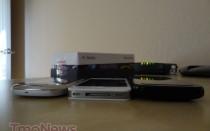
The 3.7? ClearBlack 800×480 display offers up smooth, vibrant colors and does perform very well under the sun. ClearBlack display technology adds a reflection-blocking polarizing layer between the touch layer and the display panel blocking incoming light reflections performing better under direct sunlight. There is no question, ClearBlack may sound a little gimmicky, but it performed very well and I was definitely pleased with the black levels. While “blacks” do pop on the Lumia display, I did feel it could be a bit brighter during everyday use. Perhaps I’m too used to AMOLED or Retina, but I did feel the Lumia was a bit “darker” sitting against the other phones at my desk. Still, ClearBlack 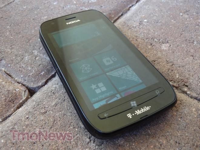 performed superbly against the Galaxy S II and iPhone screens in the sun and I would wholeheartedly recommend trying it. Along with feeling comfortable in the hands, the rubber surface on the back doesn’t allow for any fingerprints whatsoever which is a huge bonus for Nokia since that drives me absolutely nuts on black smartphones. Still, that’s a personal annoyance and fingerprints may not bother you at all.
The 1.4GHz single-core processor performed admirably on the Lumia 710. It ran smoothly on everything I did. At all times, it performed like it did right out of the box. There was no freezing or slowing down. I never felt that I had to kill background apps. This may be due to the Windows Phone software and the notion that a dual-core processor isn’t as “necessary” as it is on an Android device to run smoothly. Overall, the touchscreen exhibited almost zero lag, especially during browsing (a time in which I would notice lags or capacitive scrolling issues). Pinch-to-zoom worked very well. This is also one of the areas I find frustration on certain hardware, so I was very pleased with how it functioned.
Software:
The problem with reviewing Windows Phone 7.5 is that most people have already written it off. No matter how much praise we can heap on it, it’s already been written off by those who shiver at the words “Windows Mobile.” Windows Phone, as it stands, is starkly different than the Android and iOS varieties that are dominating smartphone lineups these days. That’s a very good thing. It’s fast, smooth, clean and social. The problem with 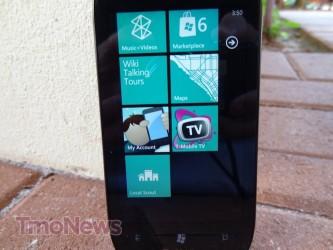 it for Android users is that it’s almost too simple and doesn’t have anywhere near the customization you can get with Android. You can theme an iPhone to your heart’s content if you jailbreak it. However, rooting and modding are very basic on the Windows Phone platform and there is not a lot of value in doing it. Even with Chevron, you can only scratch the surface compared to the top two mobile platforms.
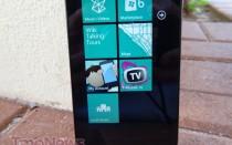
You’re welcomed by a home screen that includes the time and date. It also shows notifications for messages, emails, and missed calls. A quick swipe up and you’re at the now instantly recognizable Metro UI look, which scrolls up or down or right if you want to get to your full list of apps and settings. The tiles you “pin” on the home screen should be limited because a time will come when too many tiles is too many. How much scrolling do you really want to do? There is something about moving right to left that just seems more fluid. It could be simply because you can fit more onto the screen. I would be happier with Windows Phone if I could shrink the size of the tiles to fit more on one page, though. Even so, live tiles are pretty awesome. I especially like the “People” and “Pictures” tiles, which constantly change the images showing on the icon. It’s a simple but neat aspect of the live tile experience.
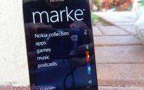
Overall, apps on Windows Phone are gorgeous. They are easily the best looking apps in the mobile landscape. I’m not saying they are always more functional, but they are easily 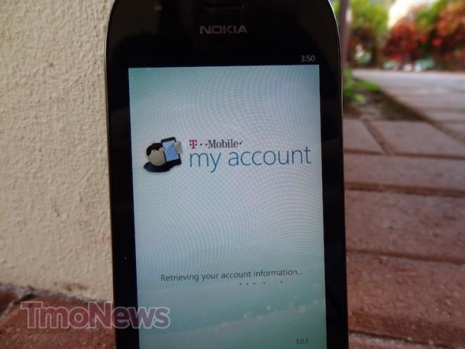 the most attractive. T-Mobile includes its standard fare with My Account and T-Mobile TV. Nokia included its own touches with Nokia Drive, Nokia Market highlights and We Care, an app detailing Nokia’s privacy policy.
One nitpick I have with my experience with the Lumia 710 was my inability to switch from mobile web to desktop web view. Out of ten news websites I tried, only one (CNN) switched to desktop mode. I don’t know if it is a fault of the software, T-Mobile or whomever, but it was incredibly annoying. Overall, Internet Explorer 9 provides a  fantastic browsing experience. Pages render very nicely in Internet Explorer and it had an incredibly smooth kinetic scrolling experience. That being said, I was still very frustrated with the mobile view and hope I was just doing something wrong rather than this being a problem with the phone.
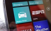
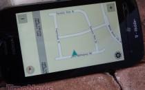
One staple of the Nokia Windows Phone experience is the addition of Nokia-specific apps including Nokia Drive — which I found to be a good and bad experience. Actual navigating directions were perfect. However, one area that I found Nokia Drive to be lacking was location searching. It couldn’t find Disney World if my life depended on it. I tried and tried and tried! I even searched with different naming conventions and I still couldn’t find Walt Disney World. I found Disney stores, but no theme park. I thought it could have been a fluke and that Disney World wasn’t locatable. But, when I brought up Navigon on my iPhone and did a quick search for “Disney World,” it yielded Epcot, Disney World, Hollywood Studios, and even Sea World. That’s exactly what I expect from a navigation system and unfortunately, Nokia Drive didn’t live up to the promise when it came down to location hunting. On the flip-side, a search for “McDonald’s” brought up every McDonald’s restaurant within a 15 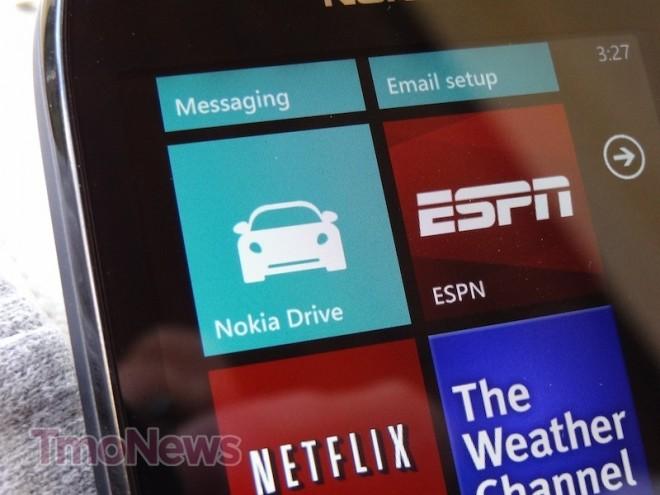 mile radius. Which was about 60 McDonald’s restaurants. Seriously. It nailed down routes to go to every one of them with ease. It’s a great feature, but please add Disney World.
I can understand why the Windows Phone platform isn’t terribly appealing for some. The lack of customization can be a real downer, except customization isn’t what Windows Phone is working toward. If you want a beautiful, simple, easy-to-use smartphone that “just works,” you would be very happy with Windows Phone.
Media and Camera:
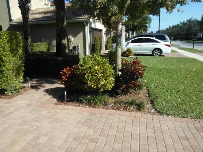
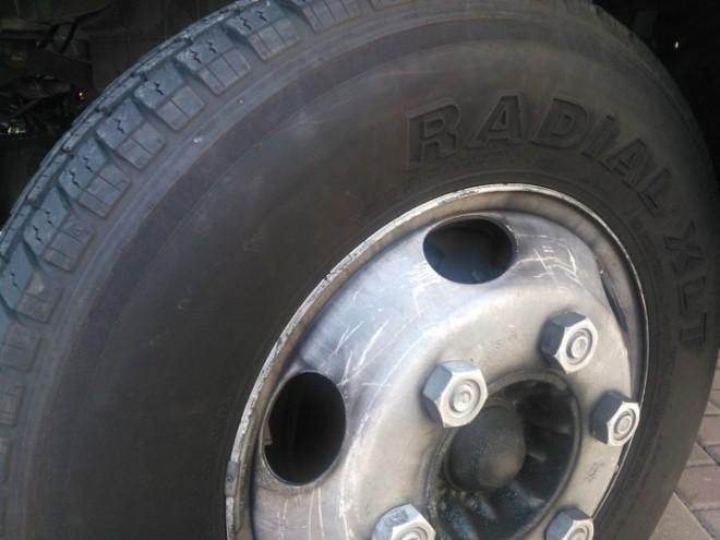
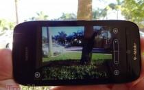
The Nokia Lumia 710 sports a five-megapixel camera on the rear and I’ll just get right the meat of it: the camera is good, not terrible, not great, just okay. I’ve come to rely on my smartphone camera since the best camera to have is the one you have with you. I don’t think this camera would fail you if Aliens landed or Bigfoot walked right in front of you, though. It’s certainly good enough 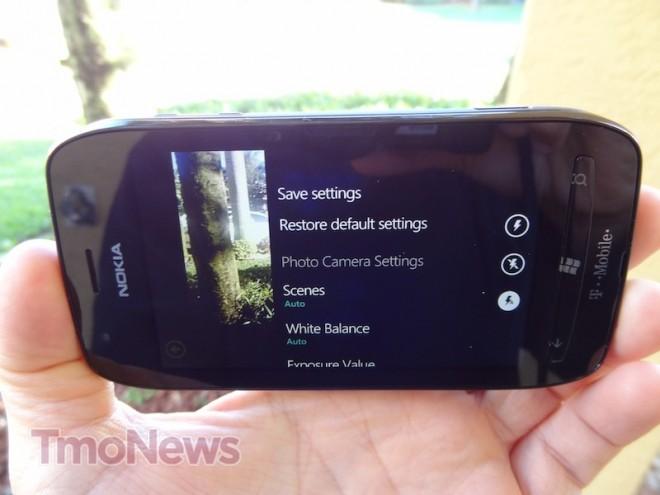 to carry around. However, I did find the flash to be a little weak and some of the images outside had colors that appeared to be be a little washed out. I took some images outside during the day yesterday (an admittedly perfectly clear day) and just found the colors to appear a little bland. I’m not super “up” on photography lingo but I just didn’t feel like the camera produced images that would stand out. It’s perfect for those “need to” moments, but if camera quality was one of your top reasons for purchasing a smartphone, I would look toward the HTC Amaze 4G, based on the quality of these images. Which is surprising, considering Nokia’s strength in the camera field.
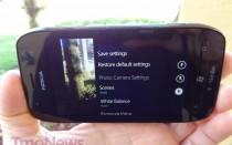
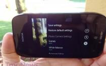
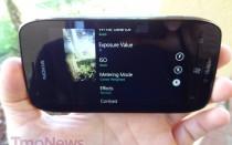
As per the usual on a Windows Phone, the camera features a number of settings to enhance the picture-taking experience. You can choose scenes, like most camera. You can also adjust white balance, exposure value ISO, metering mode, effects, contrast, saturation, focus mode, resolution and flicker reduction. The Lumia 710 includes a well-featured camera and joins the majority of Android models in offering significantly more camera features than the iPhone does.
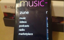
As for the music function on the Lumia 710, it’s a pretty standard Zune player. If you’ve used one or seen one in action, you know what to expect. The Metro UI allows for a yet another beautiful interface on Windows Phone. The music was loud and crisp and 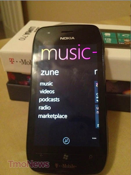 sounded excellent when I had it next to me as I did work around the house. I was very happy with the music aspect and I think the Zune experience rivals both iTunes and Android in terms of functionality and features. You can choose from songs, artists, albums, playlists and genres to help tailor your music experience. Again, pretty standard fare for a smartphone music player, but Windows Phone looks pretty while doing it.
Phone and Coverage:
When it comes to T-Mobile service, the Lumia 710 was another total win on the T-Mobile network. Call volume was loud, call quality was crisp and my signal was very strong. I happen to have moved to a new house in the past week and my T-Mobile reception is absolutely awesome. If reception and call quality were a major factor in your purchase, I’d absolutely give it a “recommended” status based on my short time with the Lumia 710.
If you are a globe-trotter, you’ll definitely like the Lumia 710. The Lumia 710 is one of the few phones that will work very well when roaming in Japan, Hong Kong, Australia, New Zealand, and the rest of Oceania. It has excellent roaming capabilities for Europe, obviously. It has great roaming capabilities for GSM and UMTS networks in Asia. It also has excellent roaming capabilities for the Americas, since it can access nearly all GSM and UMTS networks in North, Central, and South America. In summation, the Nokia Lumia 710 is one of those few phones that can roam in every region of the world quite well. For those who don’t leave the country, the Lumia 710 is also one of the few that can also roam on AT&T’s 3G network.
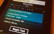
The “4G” speeds on the Lumia 710 are disappointingly limited to 14.4Mbps thereby not 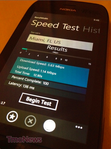 allowing the Lumia 710 to take advantage of T-Mobile’s faster HSPA+ 21Mbps or 42Mbps network. I consistently hit around 5-7Mbps on my speed tests on the downlink and hovered around 1Mbps on the uplink. Not roaring fast, but consistent and considering the home internet speeds I had my old house, 5Mbps consistently was very welcome.
With the software I’m currently using, there is no Mobile Hotspot option on T-Mobile’s network, even the HTC HD7 recently received an update that added the feature. Overall, the data speed capability disappointed me as I have come to expect faster speeds since the Galaxy S II began spoiling me. Still, the Lumia 710 isn’t “slow” by any means as web pages still loaded fast on T-Mobile’s network. App updates also ran quickly, so the “slower” speeds certainly didn’t inhibit my experience. It’s definitely not the fastest phone in T-Mobile’s lineup, which is a little unfortunate since it is T-Mobile’s first device release in 2012. We’ll be looking down the road in 2012 with the hopes that T-Mobile and Nokia can release a Windows Phone that takes full advantage of T-Mobile’s current HSPA+ 42Mbps network.
Battery:
The Lumia 710 is rated for 7 hours talk time and 16 days standby time and while I never hit the 7 hour mark, I did hit around 5.5 hours each day. That’s pretty good for me considering how often I use the phone. I always find that test periods often bring a heavier usage pattern than “everyday” use so these numbers are not very realistic. I’m hoping on a standard day, when I’m not putting the phone through its paces that I might get an extra half hour or so of juice. I’d happily take a smartphone with 6 hours of talk time without complaint. An average user should easily get a day, probably a day and a half with the Lumia 710. Given all the things sucking down juice on a smartphone these days, I can’t imagine any complaints about that.
Conclusion:
My first impression when the Nokia Lumia 710 was announced was “Oh, I can’t wait till I can get my hands on that!” Thankfully, I wasn’t disappointed. What is most important to me is Nokia’s return to the United States (regardless of the operating system) since I’ve got such a warm place in my heart for Nokia phones of old. Its recent misfortune is disappointing, given the prominence they held at the turn of the millennium. I’ve had the Lumia 710 for a little over a week and while my overall opinion of the phone is positive, Windows Phone is definitely a love it or leave it adventure. I understand that Windows Phone has yet to catch on and is still vying for a third place spot behind Android and iOS and yet, there is plenty of reason to suspect that it can be a success, if enough people take the opportunity to try it.
There isn’t a lot of compelling reasons to buy the Nokia Lumia 710 over the HTC Radar 4G. The only major advantages of the Nokia Lumia 710 over the HTC Radar 4G are the Nokia-specific apps, the ClearBlack display, and the roaming capabilities. Other than that, it’s a real trade-off between the two devices. In my humble opinion, the camera on the HTC produces better pictures but the Nokia feels better in the hand. You also get an extra 0.3? of screen real estate on the HTC.
Unlike some of the Android devices which have specific benefits over one another, such as HSPA+ 42Mbps over 21Mbps or TouchWiz over HTC Sense, the same can’t be said about the Windows Phone models. They are, for the most part, the very same. There are some unique differences but they are far and few between and that’s not always a bad thing. The uniform OS amongst various Windows Phone manufacturers allows for them to be creative to develop unique and individual apps that tailor the user experience. In the Nokia case, Nokia Drive is a big selling point. While I don’t necessarily think Nokia Drive is the best GPS app I have used on a smartphone, my experience could have been a fluke and it could be awesome. I’d have to give it more time and I’ll update this review as I use it in Las Vegas during CES to try and find my way around town.
I’ll finish this review with some closing thoughts. The Nokia Lumia 710 is a good phone and I’d highly recommend it. It does what it does very well, it just isn’t particularly compelling over other Windows Phones in the T-Mobile lineup. Then again, the HTC Radar 4G is an equally good Windows Phone offering. They are both good, which makes your decision to purchase to one of preference of the screen size, data speeds, individual offerings, and the overall feel of the device. Are you someone who works outdoors a lot that seeing the screen in the sun is problematic? Than you should check out Nokia’s ClearBlack display. Are you someone who likes Windows Phone and frequently travels outside of the United States or wants to take advantage of the AT&T 3G roaming capability? Then the Nokia Lumia 710 is a great choice for you. Otherwise, I’d suggest walking to the T-Mobile store and trying the Lumia 710 out. In conclusion, I have really enjoyed my time with the Lumia 710 other than some frustrations with the GPS app and Camera, I’ve been very satisfied in Nokia’s first US offering with Windows Phone. That being said, I’m much more interested in what Nokia is bringing to T-Mobile next and hopefully it’s called the Lumia 800. For now, if you’re looking for an inexpensive yet solid smartphone, you could do a lot worse for $49.99.

