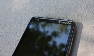
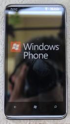
The @Tmobile @HTC HD7 @WindowsPhone #Mango Review
If you have been following me on Twitter then you probably already know how excited I have been about Mango, for the rest of you the answer is very… I am very excited. Microsoft pushed out Mango to all WP7 devices on Tuesday, kudos to them on that (take a note Google), and I was lucky enough to snag one of the first upgrades. I have had some time to get to know this new OS and decided to share my thoughts on it. It should be noted that I have no intention of starting an OS war. Comparisons will arise and I will make them to prove a point; after all, I do have some strong words to contend. Let’s get started, shall we?
On a side note – you can find my original review of Windows 7 and the HTC HD7 right here!
Also, this is a long stream of consciousness review. For a quick breakdown skip to the final thoughts.
Upgrade Process
This is the simplest, most annoying and time consumer upgrade process I have ever had to do. For one, there were two updates (maybe three for others). The first is to prepare the phone for Mango, followed (immediately mind you) by Mango. Beyond that, the update requires you to be plugged into your computer, which isn’t all that uncommon but still annoying. In addition, it will always create a backup of your device before upgrading. This is probably a good thing, but for someone like me (with 10 GB of music on their phone) this is a very long process. So a tip to those of you who have yet to receive the update – maybe you might want to possibly remove some music to speed this along, if you want. Either way, two hours and two clicks later I have Mango.
Welcome to Mango
I have to get this out of the way because I promised David that I would do this, but I don’t understand the default color scheme. Microsoft goes and names their upgraded OS Mango and make the default color RED?! Who does that? Especially since Mango is a color option in the theme settings. I guess I get it, red is a part of their logo colors, and maybe they don’t own the rights to the color mango. I don’t know, I don’t decide these things but it seems like a missed opportunity there. Also, Mango is an ugly color on the device.
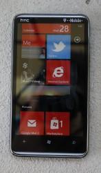
So you now have Mango, congratulations, but it doesn’t look like it has changed. Fantastic. I don’t know how many times I have upgraded Android phones just to have them look different. You see, this may be what I really love about WP7, the User Interface is the same, everywhere, even in the apps. Their metro UI is simple, sleek, organized and pretty darn good looking in this editor’s opinion. I get it, you like Android and you can customize it (and I recommend it), but you shouldn’t have to customize it just to like your phone. I have spent entirely too much time trying new homescreen replacements, adding homescreens, removing homescreens, trying widgets, changing the size of widgets and then just scrapping it all and starting over again. With WP7 (and some other notable operating systems) you don’t have much of a choice, but it is simple and functional, just the way it should be on a phone.
It doesn’t look new on the outside, but trust me, there is a sweet center under that shell. The best thing, of course, is that it is still as quick, if not quicker, as when I first took it out of the box. The animations are beautiful and fly across the screen with no stuttering. They move so gracefully that you just have to appreciate the small things, like the changing direction of the arrow as you swipe between the ‘start’ and ‘app’ pages. It is gorgeous, smooth, and once again, exactly as it should be on a phone.
Search
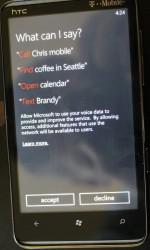
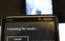
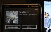
They changed some things, of course. One of the biggest changes is within the Bing search app. Now, I don’t really like Bing out of principle (I am loyal to Google after all), but they did a great job with this. Voice search is, I would say, much more accurate than Android’s. The image search is quick and accurate as well, identifying my book in less than 5 seconds. My favorite part, though, is the music identification search. In my tests it was just as accurate as Soundhound and Shazam, and as fast as Soundhound, which makes it very effective.
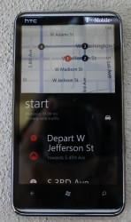
With that, you also have Turn-By-Turn Navigation, sort of. Now, it is turn-by-turn, but I feel like it misses the mark here. This phone picked up my location very accurately (scarily so), and was able to provide the correct directions. It also followed my location and moved the map with me as I moved along. These are great improvements, especially over the original map functions. With navigation, though, I expect the inclusion of voice directions as I drive. Instead, Mango forces you to tap the screen to listen to the audible directions. Now, it will give you a nice like “ding” notification when you move to the next step to remind you to look at it. Are we seeing the problem here? I thought we were trying to distract ourselves less while driving? I don’t want to look at my phone for directions and I especially don’t want other people looking at their phones for directions. I want, and I expect, voice directions, especially when Google did it so nicely.
“Never bad mouth synergy”
Social integration. I guess this is the new thing that all the cool kids are doing. We are talking Facebook and Twitter integration galore. It’s kind of cool, actually, especially with the way it is done on Mango. So I did it, jut to see how it works.
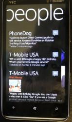
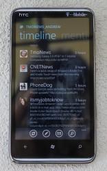
I love it. For one, and as it should be, all of my contacts are synced with their corresponding Facebook and Twitter accounts. It also aggregates all of your notifications into one panel, found in the “me” tile. You can post from there too, to all of your accounts, at the same time. It even aggregates all of the status updates in the “people” tile, which you can then view all at once or sorted by account. It is all very clean, and very minimalistic.
I hate it. Maybe you caught it up there, but I absolutely hate that all of my notifications and all of my friends updates are in two different places, different apps even. For once thing (maybe this is a benefit to some) it makes it nearly impossible to determine if the update is from Twitter or Facebook. I guess it is nice, it almost merges the two and presents them in one metro themed, white text on black background with red accents (for me), app, but I like knowing which is which (Tweetdeck has spoiled me, clearly). Back to the two app thing, I hate it. It is nice that all the notifications are aggregated and all the updates are aggregated, but it would be so much better if they were all aggregated within one app, and only a swipe away (once again, I love Tweetdeck and miss it dearly on WP7). Also, where is the support for multiple accounts? I’m sure most of you don’t share my problem, but I have two Twitter accounts and I want to be able to check them both at the same time. For these reasons, no multiple account support and the use of two different apps, I still feel the need to use the dedicated apps, and both are gorgeous in their own rights.
Facebook for WP7, even if it is still missing some features (which are kind of solved by Facebook integration – next paragraph), is much cleaner and much more reliable than its Android counterpart. Twitter is too, but it still doesn’t save my most recently read position or really give me new update notifications (I think Tweetdeck, or erm Twitter, owes me some money for pushing how much I love their Android app in a WP7 Mango review). Using these dedicated apps cleans it up for me, and makes it much easier to check specific updates, plus multiple twitter account supports, so there is that.
You’ve Got Mail, Messaging, and Chat
So back to Facebook integration. There is no chat feature in the Facebook App, but you don’t need it. Facebook chat is baked right into your messaging client. Maybe you are chatting with someone on Facebook on your phone, but they need to leave their computer. Simple, just switch to ‘text’ and you can now chat within the same app, viewing the same stream as you were before. It’s a nice feature, actually I love it, but it has problems. Not functionally, of course, but in premise. For one, only you can see this stream, so the other person is kind of out of luck. Secondly, you have to be signed into Facebook chat from your phone and be chatting with them, which is a pretty big battery drain due to always chatting. On that same point, all the messages you send via Facebook on your laptop or computer don’t transfer over to your text app. Maybe that’s too forward thinking, completely universal inboxes for communication with a single person, but I can complain about not having it, right?
A quick touch on messaging… the messaging dialog boxes for the sender and receiver are now different shades of your accent color, cool.
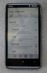
Now this was a big gripe that I had before… the lack of nested e-mails. No more with Mango. I have my nested e-mails, and it looks mighty fine as well. You can merge your e-mail accounts too, but I don’t like doing that, so I didn’t (they are different for a reason).
Multitasking
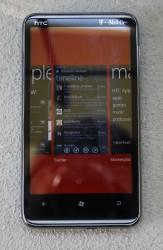
Or more accurately….quickly switch between paused apps. Mobile multitasking doesn’t really exist, not really at least. Mango allows you, though, to switch between recent apps very quickly by long pressing the back arrow. This brings up a card like view of recent apps, suspended at the same screen you were at when you left it. Jump back into an app and it starts running just like you never left it, not even a skip. Now, Mango allows for background apps as well, so you can listen to Slacker while doing other things on your phone (finally…also, can I get a Pandora app, please). I found one funny little bug, though. If you leave an app, open another app, return to the first app then open a third app (are you with me here), then the first app will show up on the recent app list twice.
“I’m Dying.”
So, battery life eh? I guess this is important. Important things to note – I’m pretty much what you would call a power user, I’m rough on my smartphone if I don’t have my iPad or laptop to share some of the weight. My phone was removed from its charger, after a full cycle, at 7 AM Wednesday September 28th. It is set to change the screen brightness automatically and does not have battery saver turned on. I have four different e-mail accounts linked, set to update as items arrive. I also have my Facebook and one Twitter account linked through the phone. The twitter app then has both twitter accounts linked, which updates and caches tweets every 10 minutes, and a dedicated Facebook app.
I would say that today was a busy twitter day, I was keeping you guys up to date on impressions and there was some tablet released or something. I used turn-by-turn navigation for 30 minutes and slacker for the same amount of time, simultaneously. I kept up multiple text message conversations, and linked them to Facebook chat for 45 minutes. I had some phone calls in there too. I made it until 7:30 PM. Twelve and a half hours, I’m not surprised and I’m not disappointed. That’s a lot of work for it to handle, and it didn’t go very long without me picking it up today. On a normal day I’m sure I can make it to 10 PM, and I’m sure you can too. Helpful hints – Facebook chat wastes your battery very quickly, turn the screen brightness to low, turn on battery saver, increase the time between checking for updates on twitter and e-mail, and (most importantly) set your phone down for an extended period of time.
Final Thoughts
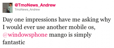
So I have some words to back up now, huh? I’ll stress the wording…I am referring to myself. I wonder why “I” would ever use another OS. A lot of you questioned me about this, so I really had to think, especially since I challenged Mango just as many times as I applauded it. I found that my problems with Mango are small, and are more often than not missed opportunities to innovate rather than follow the lead. In addition, Mango is very functional, with little to no hang-ups, stuttering or crashing.
So why do I praise Mango over the rest, and why do I think you should give it a try? Easy, because I simply enjoy using it (yes, that is entirely opinionated). It is simple and elegant, quick and functional. It does everything I need it to do, and it does it well. Other phones, with their flashing LED notifications, want me to make time for them. Windows Phone 7, and Mango specifically, allows you to check your phone on your time. Your life, simplified.
It should be said, I’m not an “App” person. All the applications I need I have, and are in the marketplace. Even so, many of the popular apps are already on the market place, and if not apps are being added at a greater rate now.
Summary
PROS
+Quick
+Clean
+Metro UI
+Multitasking
+Background Apps
+Nested e-mails
+Facebook and Twitter integration
+Bing
+Upgrade process
+New Live Tile functionality
+Multiple Calendar Support From Google Calendar
+Voice Search
+voice commands
+not iOS
+’me’ tile
+’people’ tile
Neutral
Battery
Applications
Unified Inbox
Facebook Chat
Not Android
No real ‘universal’ communication thread
No LED notifications (Mango isn’t to blame, but still)
Turn-by-Turn Navigation
CONS
-‘me’ vs ‘people’ tiles for notifications and updates
-I DON’T LIVE IN THE MOUNTAIN TIME ZONE (AZ problems)
-No support for multiple Twitter accounts
-Dedicated Twitter and Facebook apps still necessary
-No voice guided directions
-Backups
-No Voice Guided Directions

