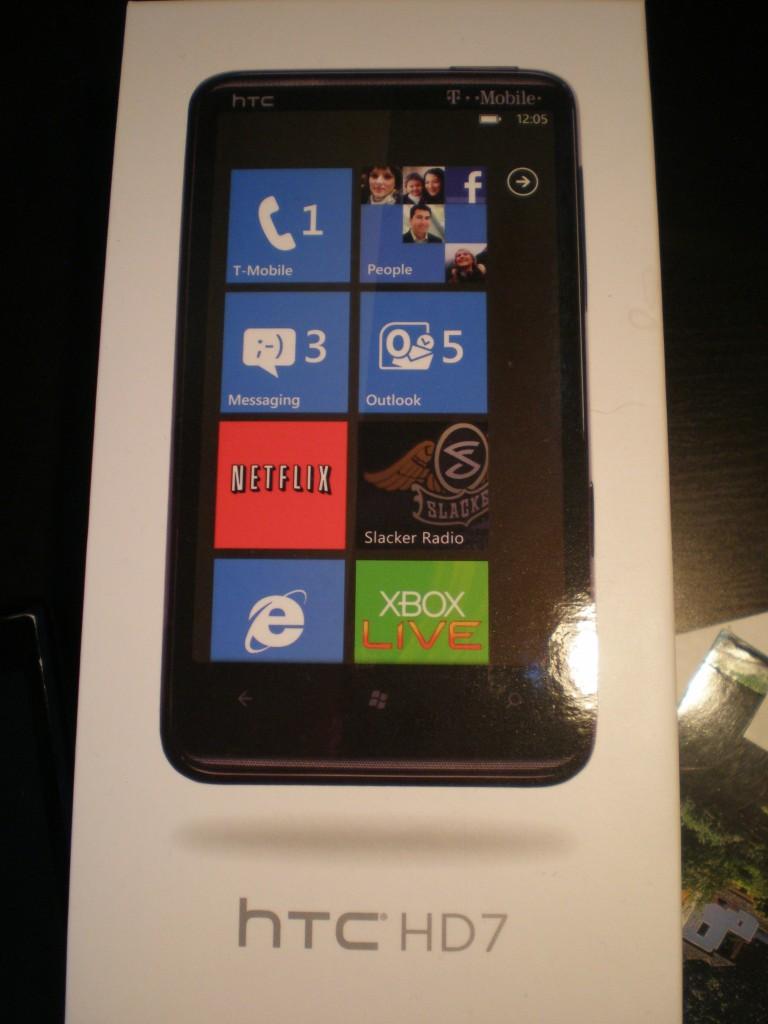
HTC HD7, A TmoNews Review
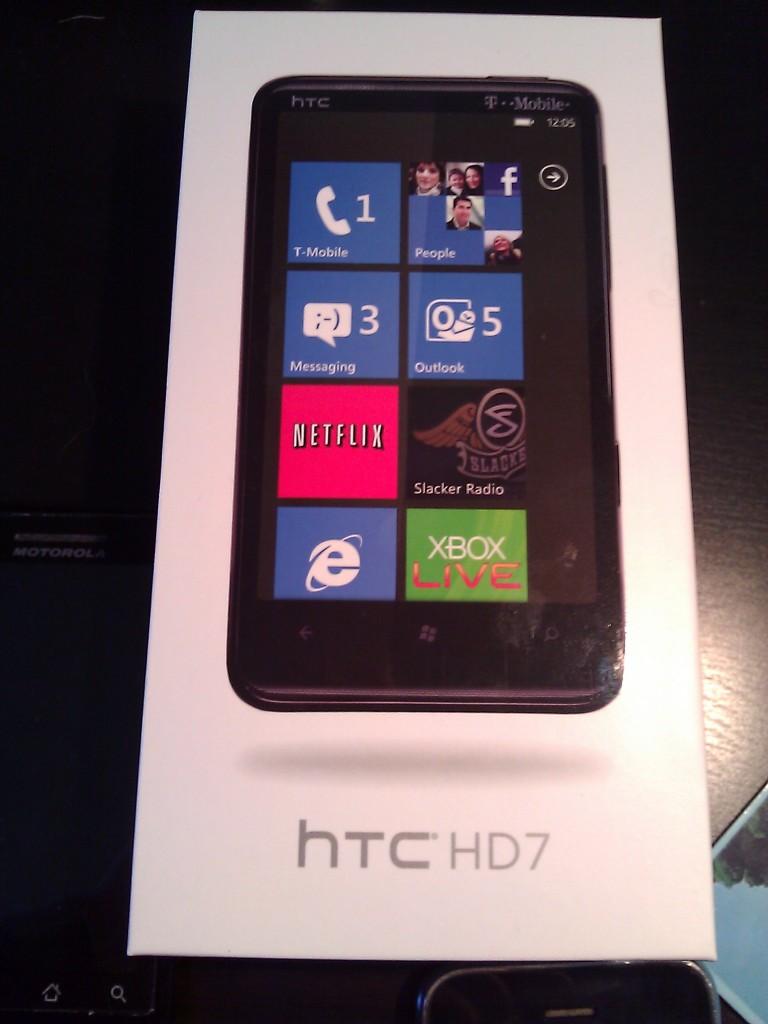
As some of you may know, I, along with David and Kickstar, picked up our very own Windows Phone 7 devices last week. We became, essentially, the early adopters of this platform, just like many of you were early adopters of Android with the G1. With little else to go on than a few short and opinionated reviews, we jumped on, hoping for something new and exciting. Personally, I picked up the HD7, and these are my thoughts.
First, an explanation. Why did I choose the HD7? Among the core editors here at TmoNews, I feel like I am the only one that truly likes Android. Sure, it has grown on Kickstar and David is starting to see the light (or the darkness, from his point of view), but I truly like it, and always have. So why did I get the HD7 over the myTouch 4G, or even the G2. The simple answer is that the HD7 fits my needs a little more than either of those devices. I really wanted a phone that could tackle media, and that is something that Android just does not do well right now (see the stock music player and lack of Netflix for now). That was the main reason why I picked it, but I also chose it because of the hardware. It is beautiful in ways that no other phone (save the nexus S and other HTC lookalikes) can match. Lastly, I really wanted something different. Android, BlackBerry and iOS are everywhere. It’s time for a change. Your needs may be different, but it works for me, plus I knew I had 14 days.
Hardware
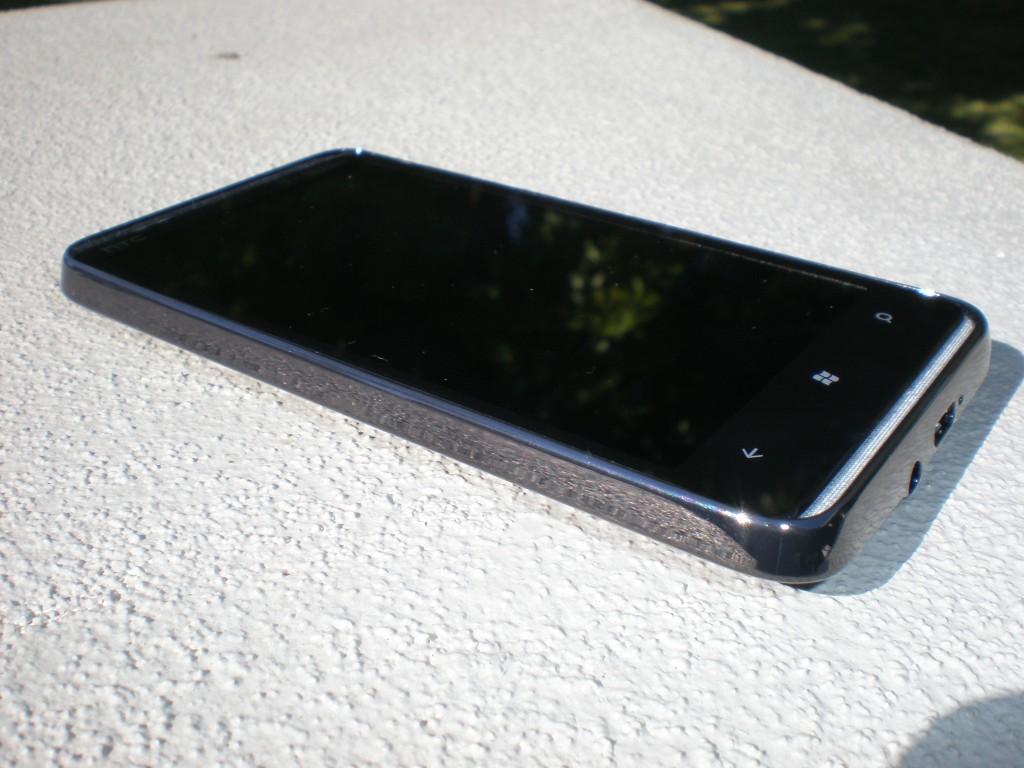
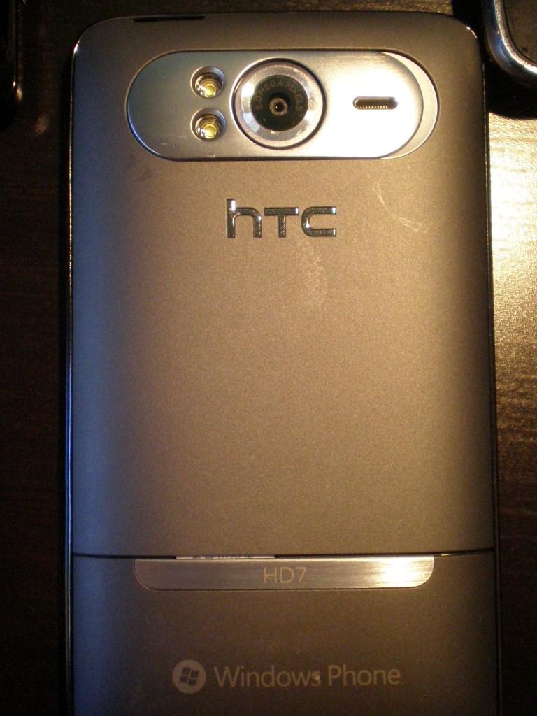
As with all phones, hardware is one of the most important things to consider. It is the one thing that you, and everyone else, sees and uses everyday. If you don’t like the hardware, then the phone is not for you. The outside of this device is gorgeous, with some minor blemishes here and there. Okay, so it’s only one minor blemish. The battery cover just doesn’t quite fit. It comes close, very very close, but it is just a tad small. It’s a small thing to poke at, but when everything else is perfect, you really need to call it out. That being said, I have one other problem with the external hardware, the power/lock switch. I don’t know if it is just recessed too much, or if the slightly sloping bezel makes it hard to press, but it is a chore to press. I can’t just pull this phone out of my pocket and turn it on. I always fumble with pressing the lock button, and I have larger hands.
Back cover, just a tad too small
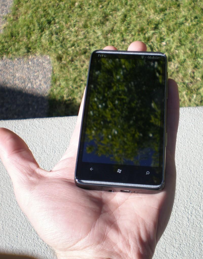
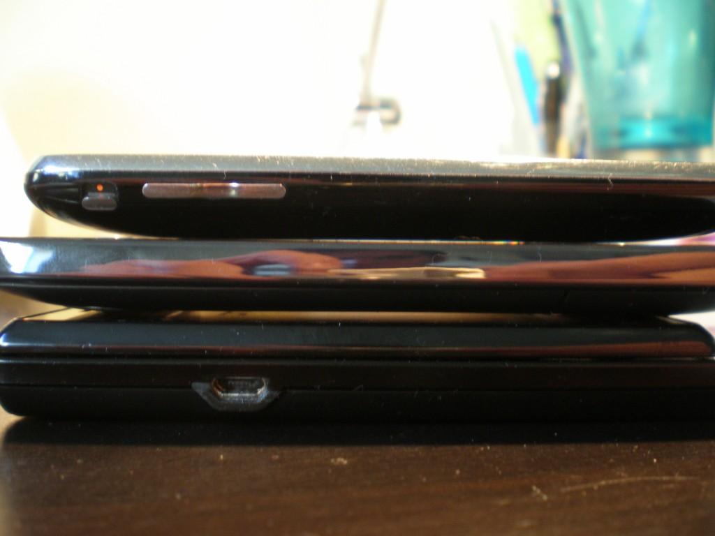
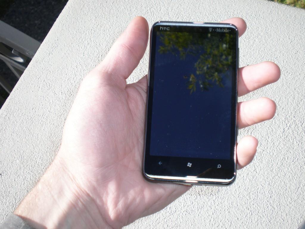
On that note, let’s talk about size. I was iffy of the size of the device going in, especially the screen size. It just seems so big. My thoughts, though, were wrong. This device is just the perfect size (for me). That may not be the case for some people, especially those with small hands, but I love how this device feels in my hand. In addition, it slips easily into my pockets. So easily, in fact, that I forget that it is there sometimes, which is saying something considering the jeans that I wear (slim fitting 7 for all Mankind jeans, in case you want a reference).
(Top to bottom: iPhone 3G, HD7, Droid)
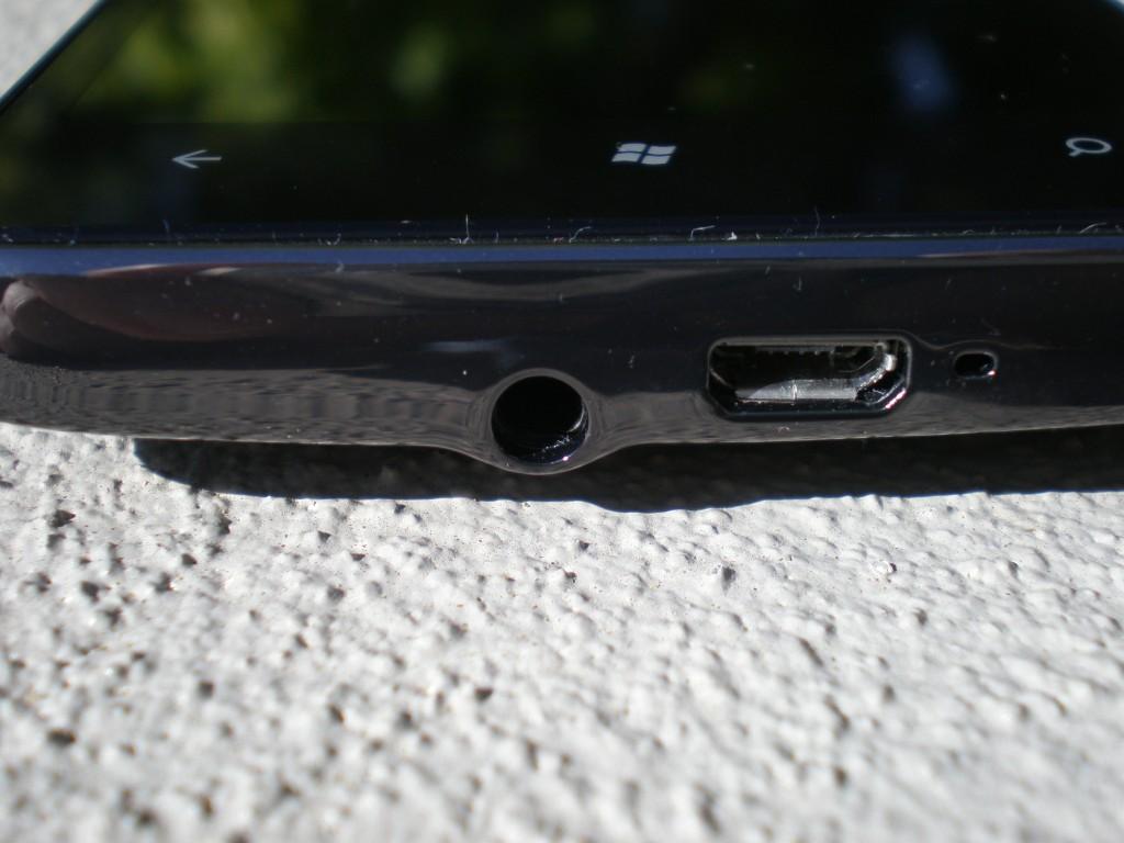
The internal hardware, however, could use a refresh. It is a device from 6 months ago in today’s market, nothing new. It has an old 1 GHz snapdragon processor and lacks HSPA+. It’s no wonder that the myTouch 4G runs circles around it (in some tasks). That being said, the snapdragon is still snappy, and proves that it is still relevant in today’s market. The 16 GB internal storage (14 GB useable) is a plus though. Other hardware, like 512 MB ROM and 576 MB RAM, make using the device a pleasant experience. You also have Bluetooth, WiFI, a host of different sensors, micro USB port and a 3.5 mm stereo audio jack. However, what self-respecting smartphone doesn’t nowadays?,
This is as good a time as any to talk about the camera. From my experience, it is good, not great, but not bad either. Sure, it could be better, but the camera isn’t the main focus of this phone. If you want to take great pictures, buy a camera. If you want to take great pictures with your phone, then there are options out there. I would say, though, that this phone is more than capable of capturing those moments where you just don’t have a camera on hand. Pictures come out clear enough with some slight pink discoloration. In addition, colors seem a bit muted. The flash seemed capable as well, given my two limited shots in the dark. Results will vary, especially if you are taking pictures outside in the dark. All in all, in a pinch, I would use the camera, but it’s not replacing my point and shoot any time soon, let alone a DSLR.
(click images for full size)
Compare this shot to the lead shot.
Testing flash in a completely dark bathroom
Windows Phone 7
It’s hard to describe Windows Phone 7. It really is. It’s just different than the other mobile operating systems. I’m not going to sit here and explain the whole UI to you. There are reviews and walkthroughs out there if you want to know more. More than that, though, I would suggest going to a store and trying it out. It is, I have found, the most pleasantly surprising aspect of this phone. I knew I would like it, and that it would take some time to get used to, but I underestimated how much I would like it and overestimated how long it would take to learn. The greatest thing, and I have been told this multiple times by different T-Mobile reps, is that this OS shares little to no code with previous Windows Mobile versions (it’s sad that this is a selling point).
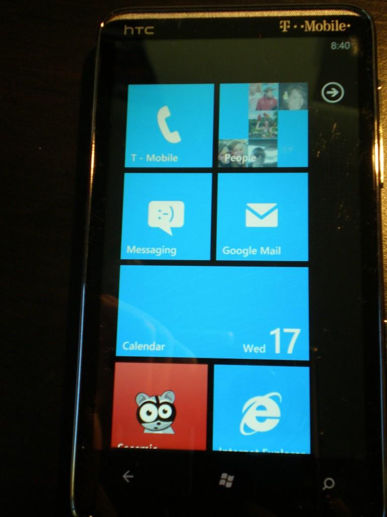
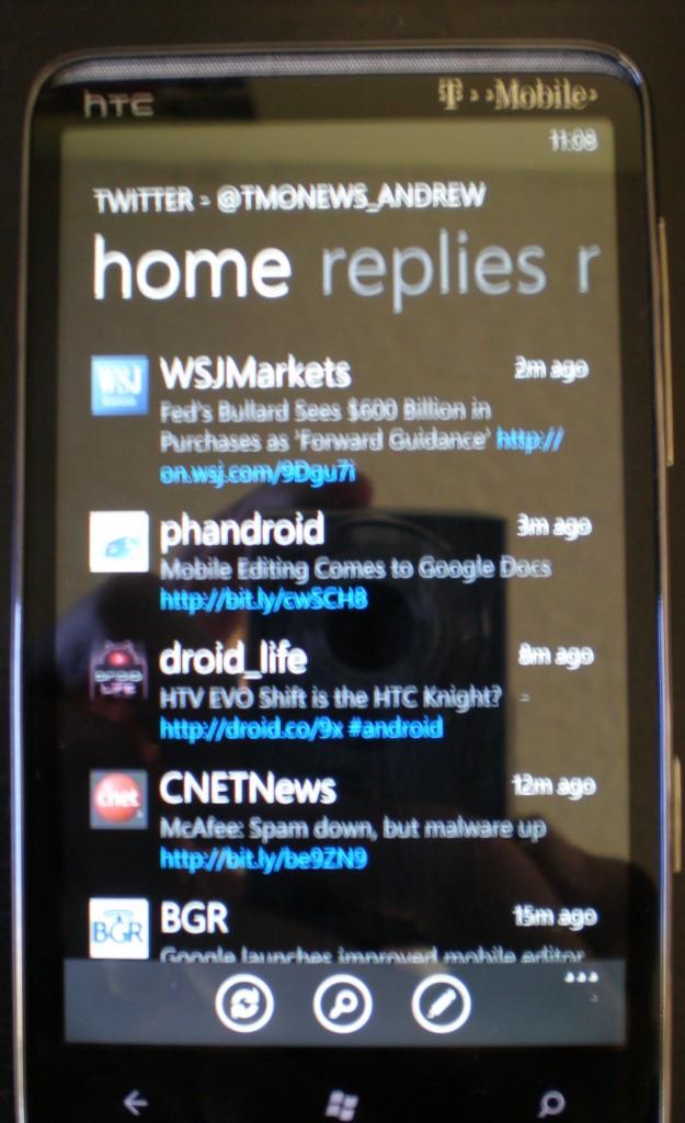
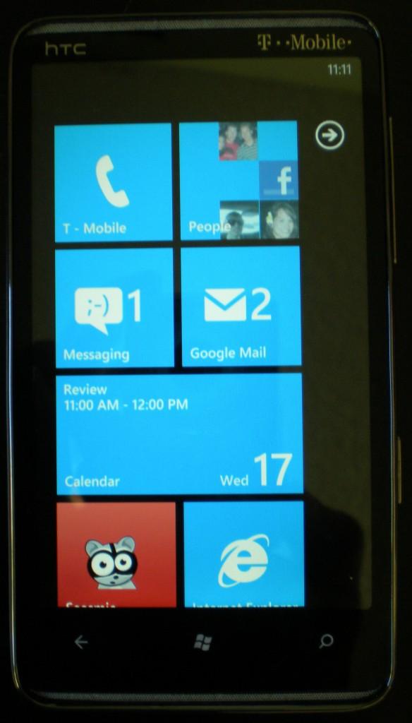
In use, the OS and UI work wonders. The whole experience is clean, modern and unified. Most of the apps that I have encountered all embrace the Metro UI, making even third party apps seem uniform. Transitions and scrolling are clean and beautiful and .very rarely is there a hiccup. That being said, there is an odd scrolling bug in third party apps where it seems like the scroll gesture isn’t recognized immediately I’m sure this will be fixed soon. The tiles make it easy to see what is going on at different times. They embody what I love about Android widgets, just simplified and clean.
I do have some complaints though. Where’s my multitasking? I’m not even asking for real multitasking, but why can’t third party apps run in the background? I want to be able to listen to Slacker Radio while reading emails or, better yet, tweets. On that subject, twitter apps should be able to update in the background and give notifications in their respective tiles. Also, no copy and paste? That just seems like a given in today’s smartphone world, and it is a missed feature. I would also like to see multiple calendar support. I don’t know about you, but my Google Calendar has four color-coded calendars in it to help keep different activities or events organized. When that account is synced, only the main calendar is synced, which is annoying because that doesn’t include my work, school, or important reminder calendars. There are problems, yes, but it’s important to remember that this is the first version of this operating system. Sure, you could argue that some of the problems, which are really just missing features, should have been addressed given the growth and power of the competition. This first effort, though, is formidable, and a much better effort than the first iterations of other operating systems, in my opinion. I do see this operating system as a great choice that will grow in time, hopefully sooner than later.
A Day in the Life (warning – stream of consciousness follows)
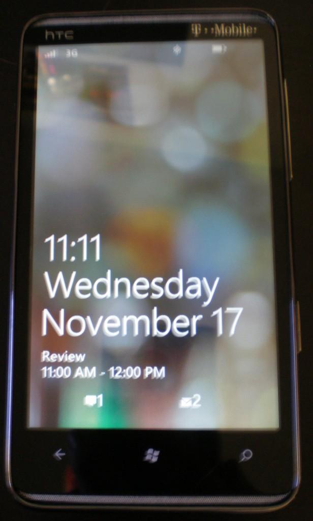
The alarm blaring, I wake up. I reach for my phone and turn on the screen, pressing, once, twice, three times before turning it on. 4:52 am. Too early, but I need to get up. I unplug the phone and roll over. Sliding the lock screen up, I make note of the 6 email notifications I have. I click on the email tile, as it counts up to 6. The tiles move away and in swing the emails. I check most of them off and delete them without diving deeper. I click on one, the pictures don’t show up, but with a simple click they download. I go back using the home button and open Seesmic. I click my main twitter account and wait as it populates and brings me to the most current tweet. I’m annoyed, remembering how my favorite Android twitter apps remember their position. I scroll down to the last tweet I remember and then scroll up. Time to get ready. In my car I plug my phone into the auxiliary cable and launch Slacker. It’s nice listening to music that I don’t own yet.
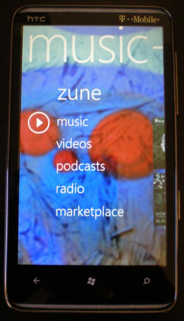
Once I arrive, I plug in my earphones and switch to the music stored in the Zune app. I have to do this, it’s the only way I can continue to listen to music while catching up on the emails and tweets that I missed while getting ready and driving. I turn on my phone and check twitter every 10 minutes or so for the next couple of hours. I miss Android’s LED notifications for emails already, and the vibrate is so soft that I barely feel it (I rarely turn on the ringer). Back to listening to music, I start up an email conversation with David (secret stuff, like new phones and what we are going to buy on Black Friday). Off, on, off, on, 15 emails in 10 minutes, all while listening to music. Whenever I pull the phone out of my pocket and turn on the screen, the volume in my headphones, which are giving me great sound quality by the way, changes. I did some web browsing at this point; there were some stories that I needed to read. I love the browsing experience; it looks great on this phone. I set the phone aside; I needed to get to studying. Not receiving blaring LED updates was nice in this case. Some time later, I turn on the screen and try to catch up on everything, 5 emails and 4 hours worth of twitter updates, on two different twitter accounts. The music is back on, Slacker again, as I drive home.
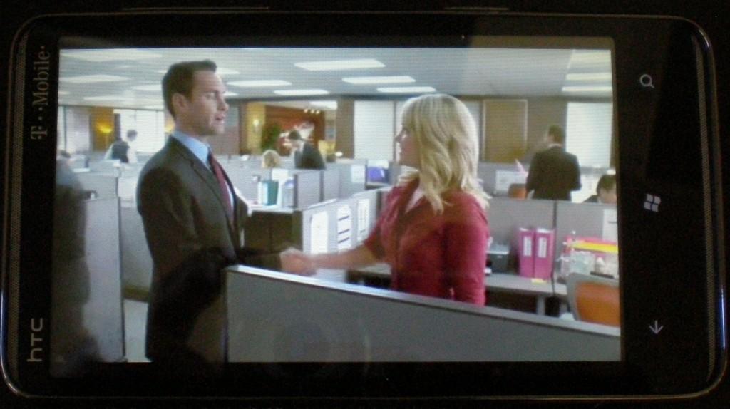
I decide to give the Netflix app a trial while I eat dinner. Using the kickstand, I prop the phone up on my desk, the speakers are weak, barely passing as stereo. The video is streaming without any problems, but the quality could definitely be better. I catch up on everything again before plugging in the headphones and starting up music again. I was on my laptop at this point and only using my phone for twitter updates, which still don’t save my position. More of the same until 9:58 when the red LED warns me of my low battery. I keep going, trying to push as much juice out of this phone as possible. It turns itself off at 11:10. It at least had the courtesy of telling me “Goodbye!” on the screen before shutting off. I guess it’s time for some sleep.
It Was What I Thought It Was
I must say, there weren’t really any surprises. The UI was simple, clean, elegant, but I knew that going in. That hardware was refined, beautiful, and shiny, just like I expected. All of the problems that I have with the OS are what I expected, and all of the things that I like about the OS are as expected. So much was already known about this device and OS that it was impossible to surprise me. It is because of this that I have to agree with another gadget blog. This is a firm Meh. It’s not great, but it will certainly make a lot of people happy. More importantly, it helps rid the bad taste accompanied by the previous Windows Mobile. If you are looking for something capable, intuitive and efficient, this is the phone for you. Personally, I’m waiting to see how this whole Nexus S thing shakes out. Otherwise, I think this, or some newer WP7 hardware, may be the phone for me.

