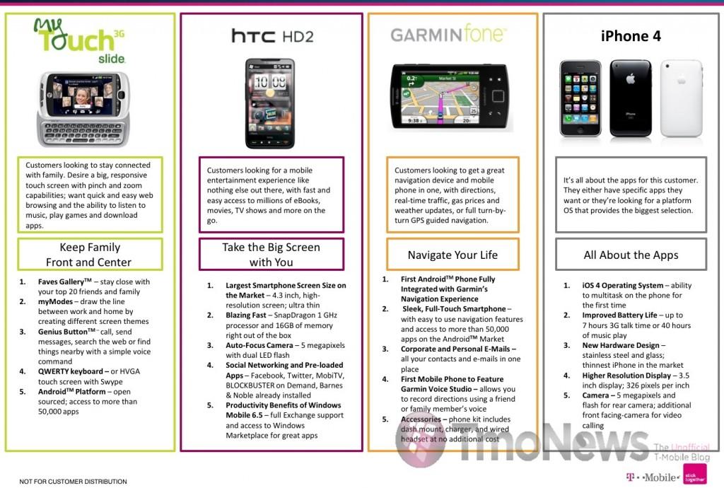
It’s not uncommon for carriers to release a bullet point comparison sheet when a competitor is about to drop a major device onto the scene. Considering it doesn’t get any bigger than iPhone 4, the fact that T-Mobile has a comparison chart available for its employees is hardly news. We think its well beyond safe to say that Sprint and Verizon have either posted their own or will do so in the coming days. What’s interesting about this picture and please don’t think we’re reading any more into it than what can be taken at face value is that it really doesn’t highlight the strengths of other devices over the iPhone’s. To be sure, the myTouch Slide, HTC HD2 and Garminfone all have their highlights, strengths and weaknesses when compared to each other, never mind the iPhone. So this is less of a comparison chart and more of an “I have no idea what the intended goal here is.” Not to mention, does anyone realize that for the iPhone 4, pictured is the 3GS?
Lets keep the comments civil shall we?

