TmoNews Goes Hands On With Samsung Behold 2

The list of phones these days that actually gets me into a frenzy remains remarkably short considering my nerd-like excitement over new devices. That being said, the Samsung Behold 2 was on the short list of phones I was really looking forward to getting for a hands-on evaluation and, thanks to the fine folks at Samsung, TmoNews has its very first review device.
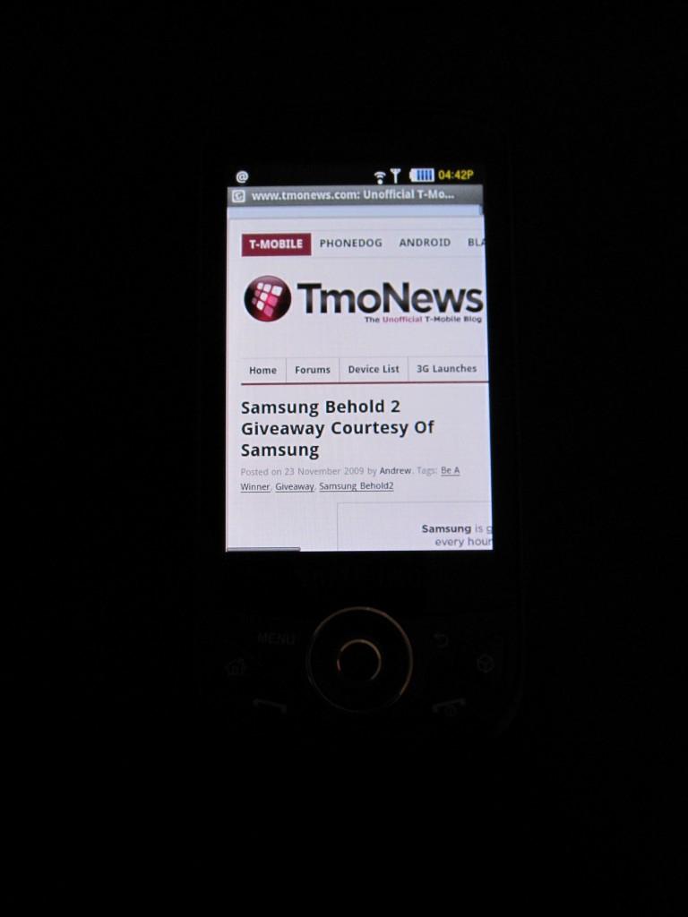
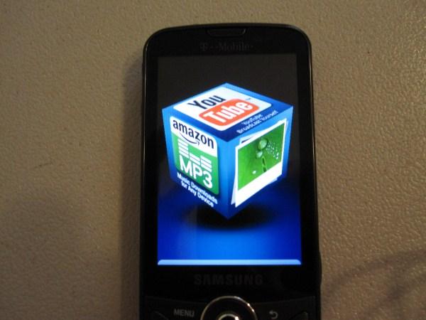
We’ve seen quite a few reviews of this device already, ranging from decent to just plain disgust and I’m falling somewhere in the middle. The phone has some things to love and other features that will make you want to scream. We can start with the Touchwiz UI, or the Cube as it’s properly called, and, frankly, I don’t like it. I don’t out and out hate it as others have clearly expressed, but it’s certainly not my cup of tea. On the opposite end of the spectrum though is the screen, AMOLED goodness that makes my heart warm. It’s beautiful, clear and did I mention beautiful.
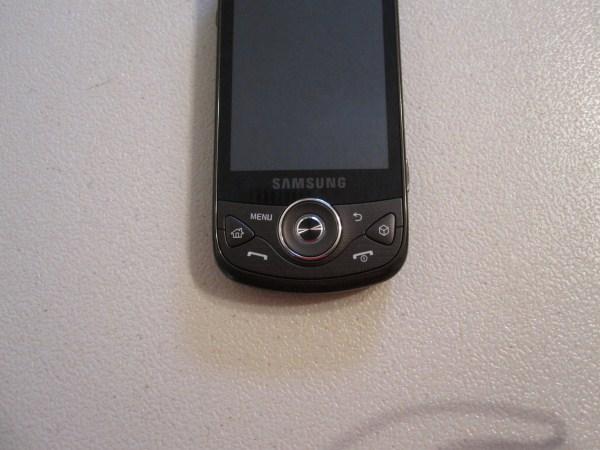
A description of the exterior of the device can be summarized in one word, solid. Like its predecessor, it’s comfortable to hold, albeit a little larger in terms of both height and width. Still, I had no complaints when holding it in my baby-sized hands as it was comfortable to talk and text without any difficulty. The 3.2 inch AMOLED touchscreen is just gorgeous, nothing but brilliance here. As an iPhone owner, I’m used to a clear and vibrant screen and, in my opinion; the iPhone doesn’t hold a candle to the Behold 2 in terms of how deep the colors are. As for the map of the world on the back, it’s just oddly placed and its real purpose just eludes me.
While the screen itself is beautiful, the amount of buttons under the screen seems convoluted and unnecessary. I would prefer either buttons that are touch based or simply less buttons. Aside from all this, the lock key mechanism on the side sucks. It’s just not convenient to constantly have to lock/unlock the screen to use it and it’s frustrating also. Aside from the button bonanza, the exterior of the phone is not spectacular, but not anything that would make me hesitate recommending this to your grandmother.

As for the software that makes the Samsung Behold 2 go round, it’s a smorgasbord of typical Android mixed together with Samsung’s TouchWiz. The Wi-Fi, camera and Bluetooth controls are straight TouchWiz and it’s not bad at all. In fact, the camera controls are actually quite pleasant and produce pictures that make this a mighty fine substitute if you ever see an alien spaceship land in front of you.
The 3D cube, however, makes me wonder how many meetings the people at Samsung had trying to decide if this should have been added in or not. Frankly, it’s pointless and I think the phone would have been better off without it. It serves no real purpose other than to try and beautify options that simply don’t need beautification of any kind. I like simple; simple is good and this isn’t simple. It’s downright messy.

Aside from all this, the standard Android menu now pops up from the left side rather than the bottom which is hardly important, but it is frustrating at the same time. I am constantly looking to the bottom to pull up the menu and it’s never there—it’s turned my world upside down. I like it on the bottom, I want it on the bottom and I demand from this moment forward, all Android developers do so. However, as much as I don’t care for some of the software features, everything looks damn better on this phone than it did on the Cliq. The AMOLED screen makes everything that much more exciting to use because it just looks nicer.
I never bothered with the Multimedia functions since I am spoiled by those of other devices, including the iTunes integration of the iPhone, one of my primary reasons for owning the device. The business support for this device is not something I could recommend since opening up documents proved to be a challenge as no editing software was included to view documents, nevermind editing them. Calls were on par with the previous Behold, loud. However, other T-Mobile devices including the Cliq have terrific voice quality as per Motorola standards.
This is a phone directed at consumers and, while business users can find solutions to missing elements in the Android market, it’s not a phone I would recommend. Those persons looking for a device that elevates them to smartphone status as well as jumping on the Android bandwagon would do well here but business users take heed. A $229 price point for a phone that is decidedly average is a deal breaker though. Drop this to $149 and it becomes that much more attractive. For now, I’d say give it a really good run in the store before deciding to buy.
